How I framed the project at the start: the goal, the people it serves, and the limits to design within.
Working assumptions, based on the product's purpose and its screens.
← All work
Statement of Information filing
A landing page for a service that files California Statements of Information online, so business owners can hand off the paperwork.
- Type
- Landing page
- Platform
- Website
- Topic
- California business filings
A government filing is something people want to finish, not study. The page explains the service in a headline, the process in three steps, and the choice of form in plain groups.
The brief.
Goal
Convince a business owner to hand off a California Statement of Information filing, and get them to start.
Users
Owners and officers of California corporations and LLCs who must file but are unsure which form applies.
Constraints
A regulated, unfamiliar topic. Four different forms. Trust and a clear price matter. It all has to work as one scrolling page.
Who it's for.
Two proto-personas show the kinds of people the design is built for: what they want, what gets in their way, and what they need from the product.
Proto-personas come from assumptions about the audience, not from interviews. They are meant to be checked with real users.Sofia, 36
LLC owner, new company- Goal
- File the first Statement of Information correctly.
- Frustration
- Not knowing which form applies to her company.
- Needs
- Forms explained by situation, and reassurance that someone will handle it.
James, 52
Corporation officer- Goal
- Update officers or the address, and avoid penalties.
- Frustration
- Deadlines and paperwork.
- Needs
- Reminders, a clear price and a confirmation copy.
Follow the journey.
The journey follows one person from start to finish. For each stage it notes what they do, what they might be thinking, and how the design answers it.
Land
DoesArrives from search and reads the headline.
ThinksIs this the service I need?
Design responseOne headline with the whole offer, and Apply Now in the menu.
Understand
DoesScans how it works.
ThinksWhat exactly happens after I apply?
Design responseThree steps, with the middle one highlighted.
Find the form
DoesLooks for the form that applies.
ThinksWhich one is mine?
Design responseFour form cards and a grouping by situation.
Decide
DoesChecks the price, the reviews and the FAQs.
ThinksCan I trust this, and what does it cost?
Design responseA plain pricing card, reviews and FAQs.
Start
DoesClicks Get Started or sends a message.
ThinksHow do I begin?
Design responseOne primary button and a short contact form.
Map the structure.
The structure shows how the screens are grouped, so every function has one clear home and related things sit together.
Landing page
Menu
- What We File
- How It Works
- Pricing
- Reviews
- FAQs
- Contact
- Apply Now
Understand
- Hero
- How it works: three steps
Choose
- Four forms: SI-550, LLC-12, SI-100, LLC-12A
- Why choose us
- Forms grouped by situation
Decide
- Pricing
- Reviews
- FAQ
Act
- Get Started Today
- Contact form
The flow and the principles.
The path through the product
- 1Land on the hero
- 2Understand the process in three steps
- 3Pick the right form
- 4Check the price
- 5Read reviews and FAQs
- 6Get started or contact
Principles behind the decisions
Hick's law
Four forms are grouped by situation (initial, update, no change), so the choice becomes shorter.
Chunking
The process is three steps and the reasons are four numbered cards, so each fits in one glance.
Transparency and proof
A plain pricing card, reviews and FAQs answer doubts before the button is asked for.
One primary action
Apply Now and Get Started Today share one purple, and everything else stays quiet.
From problems to answers.
Each assumed problem has a specific answer in the design. The screens that follow show them in detail.
Problem: Not knowing which form to fileForm cards, and a grouping by situation: initial, update, no change.
Problem: Distrust of an unfamiliar online serviceA plain pricing card, reviews and FAQs before the main button.
Problem: Too many steps feels like effortA three-step explanation and one primary action.
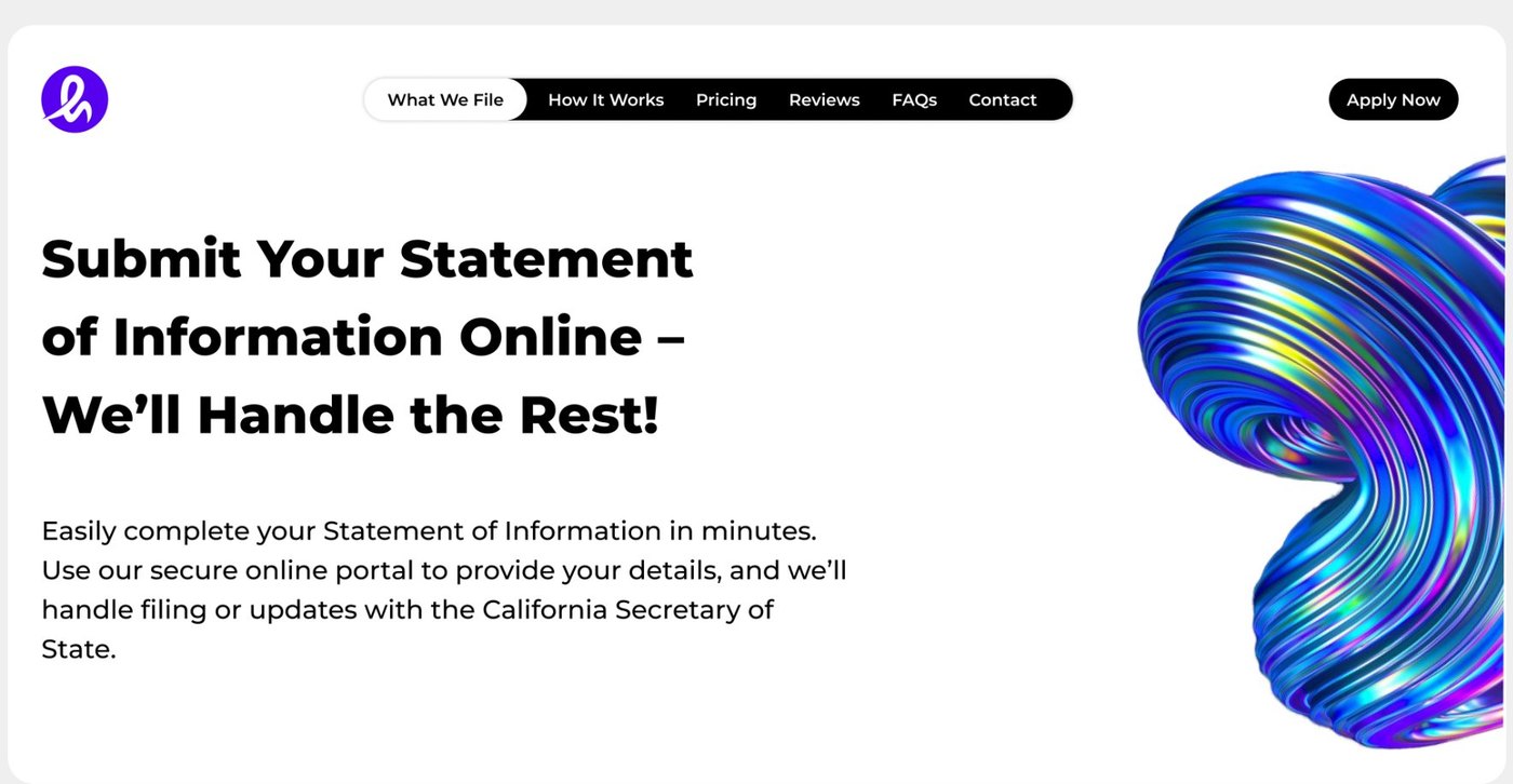
Say the whole offer in one headline.
Submit online, we handle the rest. The headline carries the whole promise in a line and a half, with a short paragraph underneath. Apply Now stays in the top bar so the next step is always visible.
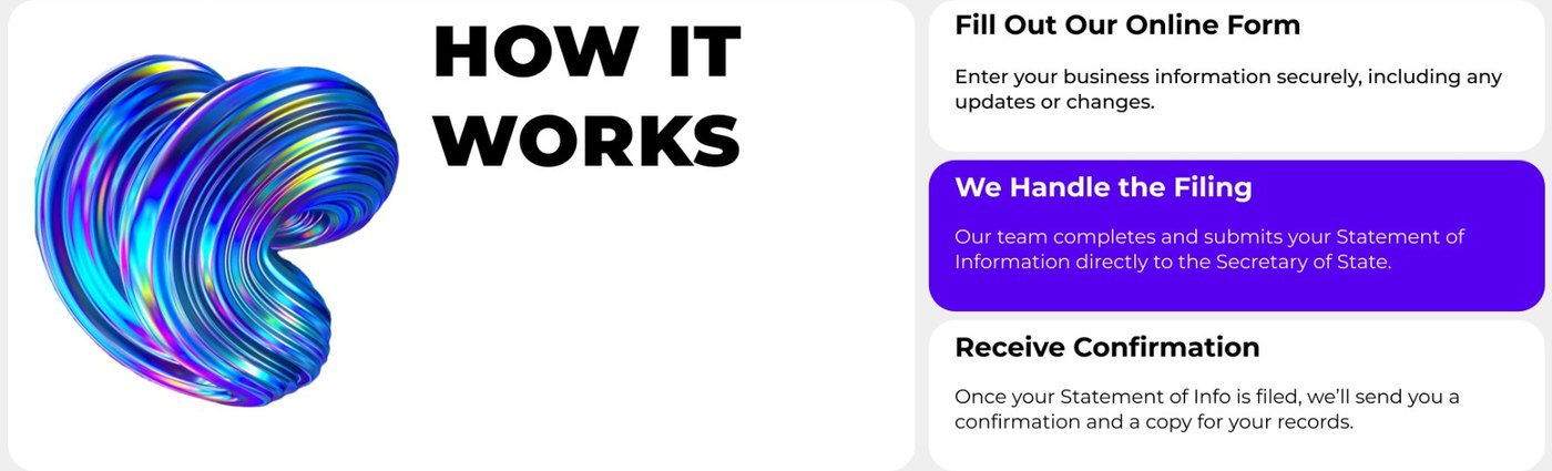
Three steps, one highlighted. How it works is three cards: fill out the form, we handle the filing, receive confirmation. The middle one is purple, because it is the part that sets the service apart.
A bold shape for color. An iridescent 3D ribbon adds energy to a topic that could feel dry, without competing with the text.
Make a confusing choice simple.
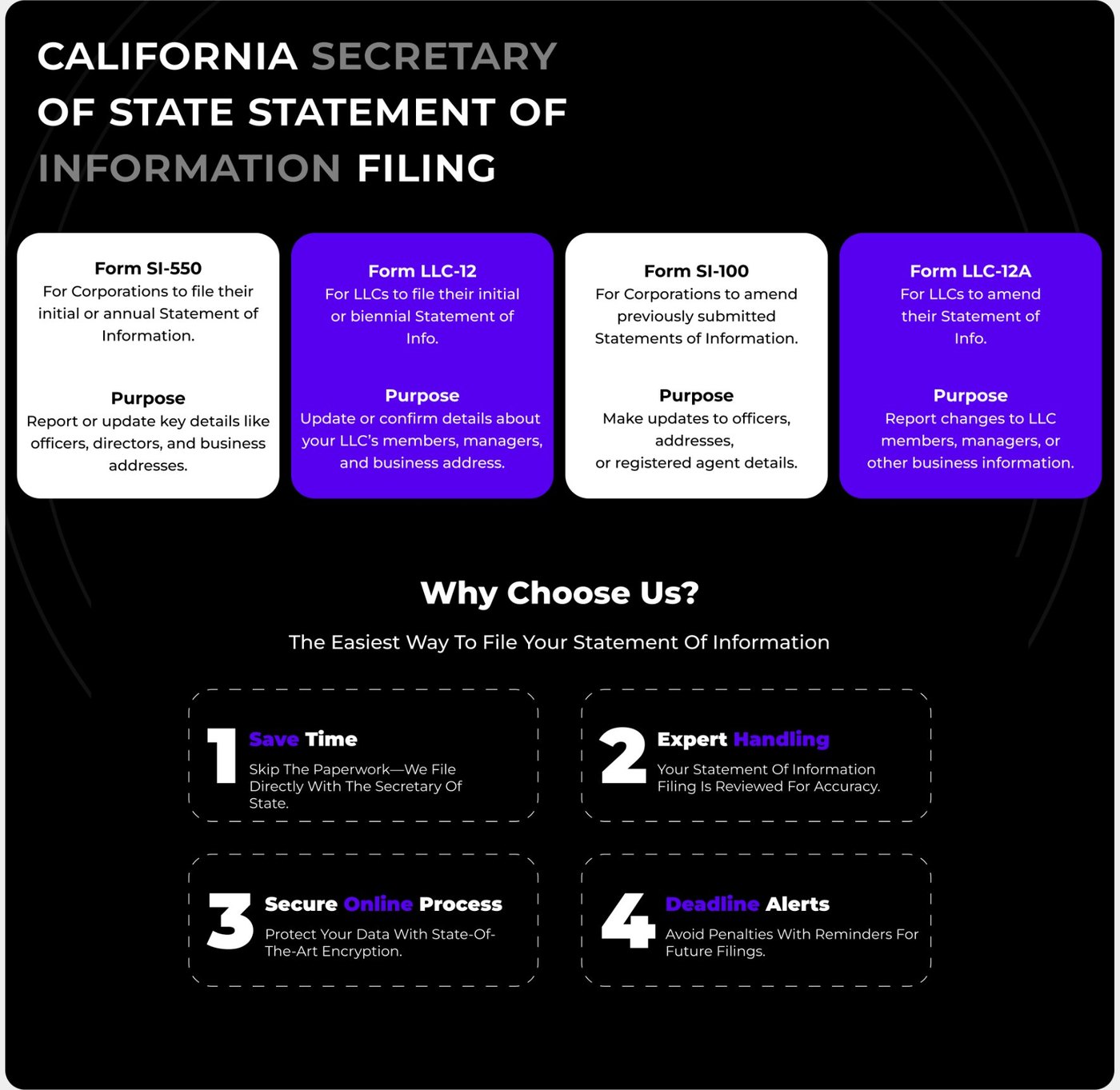
Four forms, four cards. Each card names the form, says who it is for, and states its purpose. White and purple alternate, so the four are easy to tell apart at a glance.
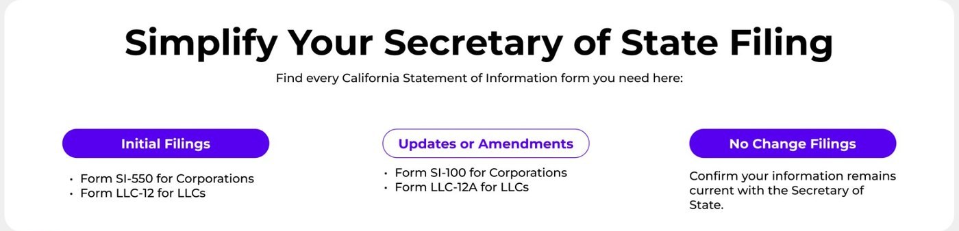
Grouped by what you need to do. A second section sorts the forms into initial filings, updates or amendments, and no-change filings, so a visitor can start from their situation instead of a form number.
Four reasons, numbered. Below the forms, a dark section lists four reasons to choose the service. Large numbers and dashed cards make them read as a quick checklist.
Keep price and proof close to the button.
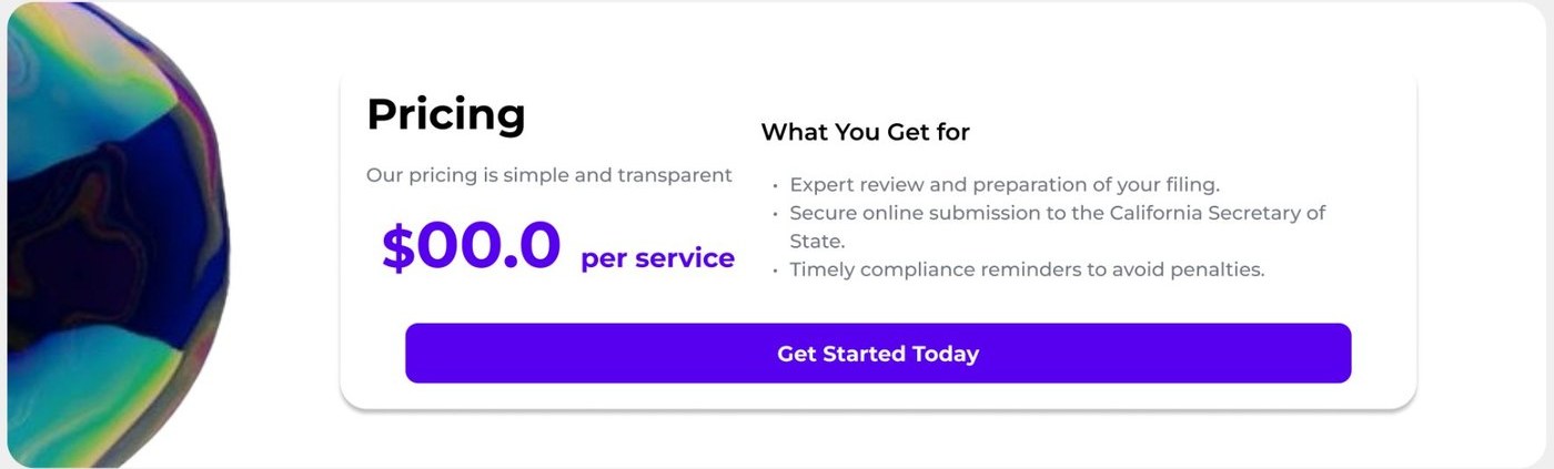
Pricing in one card. The price is large and purple, with a short list of what's included, and a single full-width button, Get Started Today, sits right below.
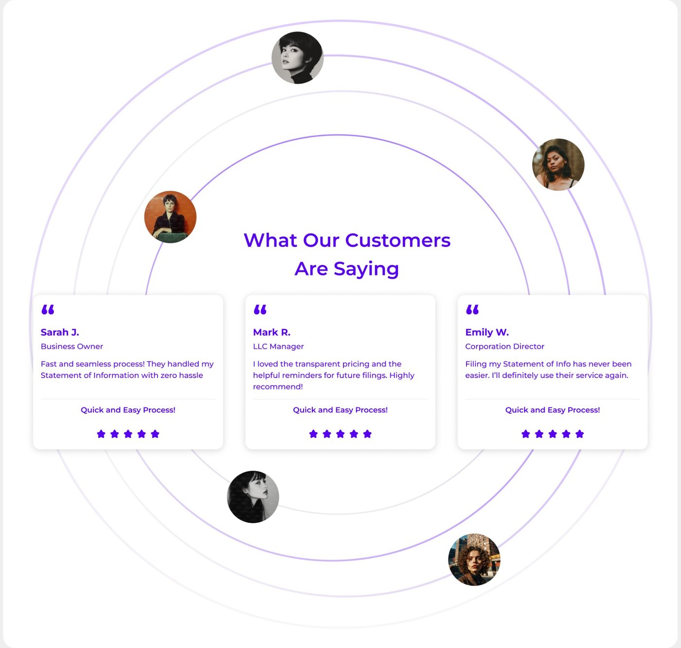
Reviews with a human feel. Three review cards, each with a name, a role, a short quote and five stars, sit inside soft orbit rings with portraits around them.
Answer questions, then make contact easy.
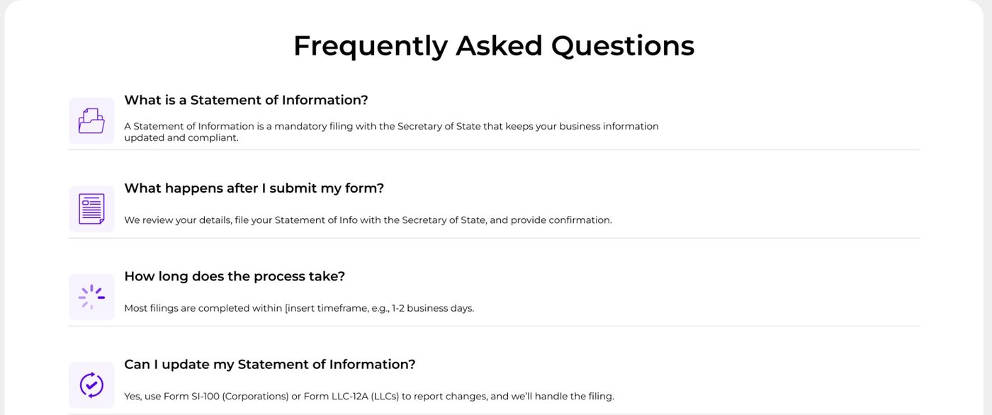
FAQs with small icons. Four common questions each get a title, a one-line answer and a small purple icon, so the list is quick to scan.
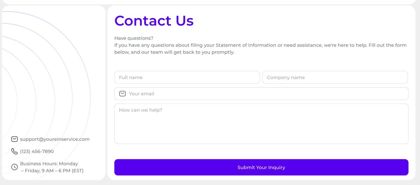
A short contact form. Name, company, email and a message, then one button. Contact details and business hours sit beside it for people who prefer to call or write.
How I'd validate it.
These are planned tests, not results. They show how the design would be checked with real users, and what would be measured.
Comprehension test
Give a situation and ask people to pick the right form.
Five-second test
Show the hero and ask what the service does.
Click tracking
Track Apply Now and Get Started Today, and where people leave.
FAQ review
Collect real customer questions and update the FAQ.