How I framed the project at the start: the goal, the people it serves, and the limits to design within.
Working assumptions, based on the product's purpose and its screens.
← All work
Safeline partner dashboard
A web dashboard where referral partners manage insurance quotes and orders for trucking companies, follow what they earn, and cash it out.
- Product
- Partner dashboard
- Platform
- Web
- Scope
- Quotes, orders, balance, account settings
A partner brings in customers and wants to know three things: where each quote stands, what it is worth to them, and when they get paid. The dashboard is built around those answers, with the same layout from the first list to the last setting.
The brief.
Goal
Give referral partners one place to manage insurance quotes and orders, see what they earn, and get paid.
Users
Partners who refer trucking companies and follow the results.
Constraints
Money is involved, so trust and clarity matter. Verification documents are required. The same record moves from quote to order.
Who it's for.
Two proto-personas show the kinds of people the design is built for: what they want, what gets in their way, and what they need from the product.
Proto-personas come from assumptions about the audience, not from interviews. They are meant to be checked with real users.Ethan, 41
Referral partner, insurance broker- Goal
- Track the quotes he referred and the commission on each.
- Frustration
- Not knowing a quote's status or what he earned.
- Needs
- Clear statuses, earnings per order and a history.
Olivia, 33
Fleet consultant- Goal
- Create quotes for trucking clients and keep their documents together.
- Frustration
- Files and notes scattered across email.
- Needs
- One record per quote with files, notes and history.
Follow the journey.
The journey follows one person from start to finish. For each stage it notes what they do, what they might be thinking, and how the design answers it.
Verify
DoesUploads the SSN and EIN documents.
ThinksHow long until I'm approved?
Design responseA status label, an uploads list with Pending or Approved, and a review time note.
Create a quote
DoesAdds a quote for a trucking company.
ThinksWhat does this client need covered?
Design responseCoverage and Vehicles tabs on one record.
Follow it
DoesOpens the detail page, adds notes and files.
ThinksWhat changed, and who did it?
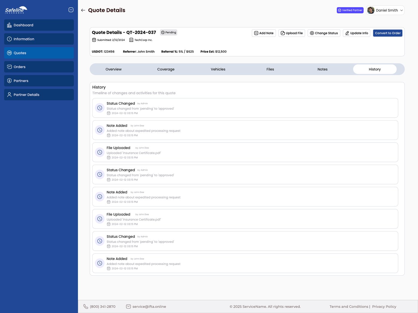
Design responseNotes, Files and a History timeline.
Convert
DoesTurns an approved quote into an order.
ThinksIs it ready to convert?
Design responseConvert to Order as the main action, on quotes only.
Earn
DoesChecks the balance and cashes out.
ThinksHow much is mine, and when do I get paid?
Design responseThe balance first, a transaction list, verified accounts only.
Map the structure.
The structure shows how the screens are grouped, so every function has one clear home and related things sit together.
Partner dashboard
Sidebar
- Dashboard
- Information
- Quotes
- Orders
- Partners
- Partner details
Quote or order
- Overview
- Coverage
- Vehicles
- Files
- Notes
- History
- Actions: add note, upload file, change status, update info
Balance
- Current balance
- Cash out
- Transaction history
- Bank accounts
Account settings
- Profile
- Security
- Verification
- Referral
The flow and the principles.
The path through the product
- 1Sign in as a partner
- 2Verify the account
- 3Create or follow a quote
- 4Convert it to an order
- 5See earnings
- 6Cash out to a verified bank account
Principles behind the decisions
Consistency and standards
Quotes and orders share one list pattern and one detail layout.
Recognition over recall
Six tabs on the detail page and a fixed row of actions mean nothing has to be remembered.
Error prevention
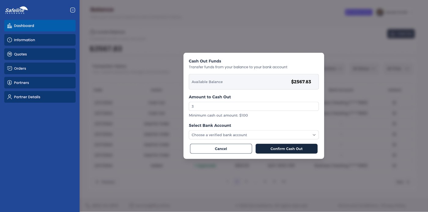
Only verified bank accounts can be chosen, and the minimum cash out is written under the field.
Trust through transparency
Verification status, a history timeline and a transaction list show what happened and when.
From problems to answers.
Each assumed problem has a specific answer in the design. The screens that follow show them in detail.
Problem: Not knowing where a quote standsStatus labels in lists, and a History timeline on every record.
Problem: Earnings are hard to seeReferral percentage and earned amount in orders, and a balance with a transaction list.
Problem: Mistakes with moneyOnly verified bank accounts can be chosen, and the minimum cash out is written under the field.
Quotes and orders, in the same shape.
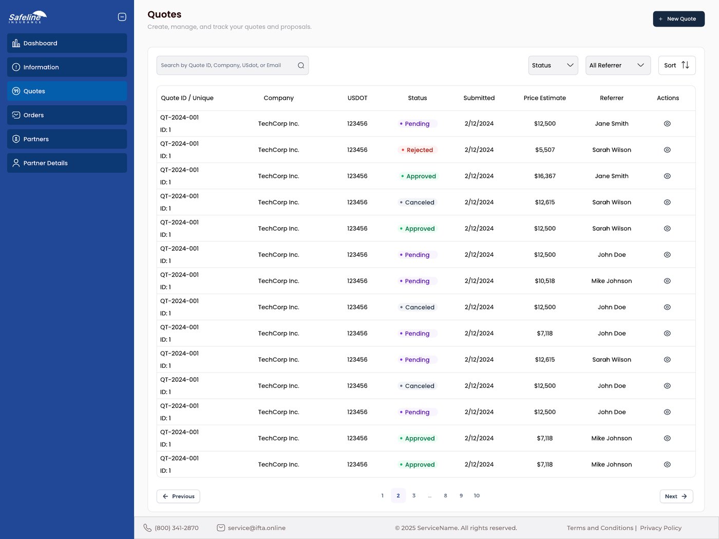
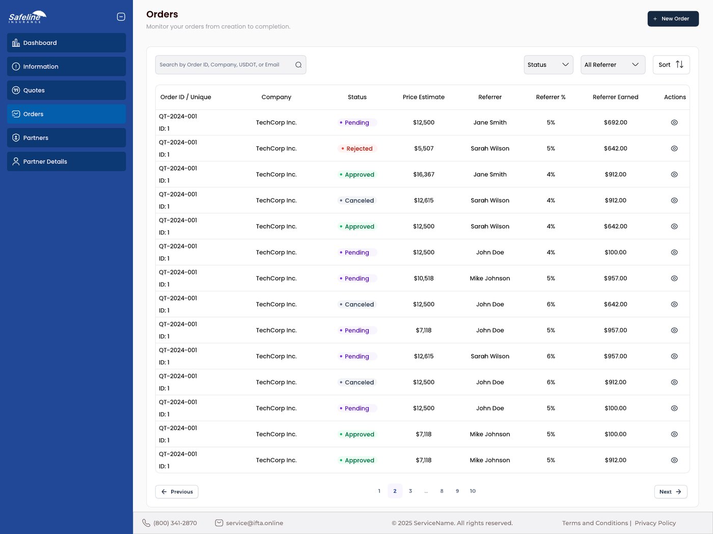
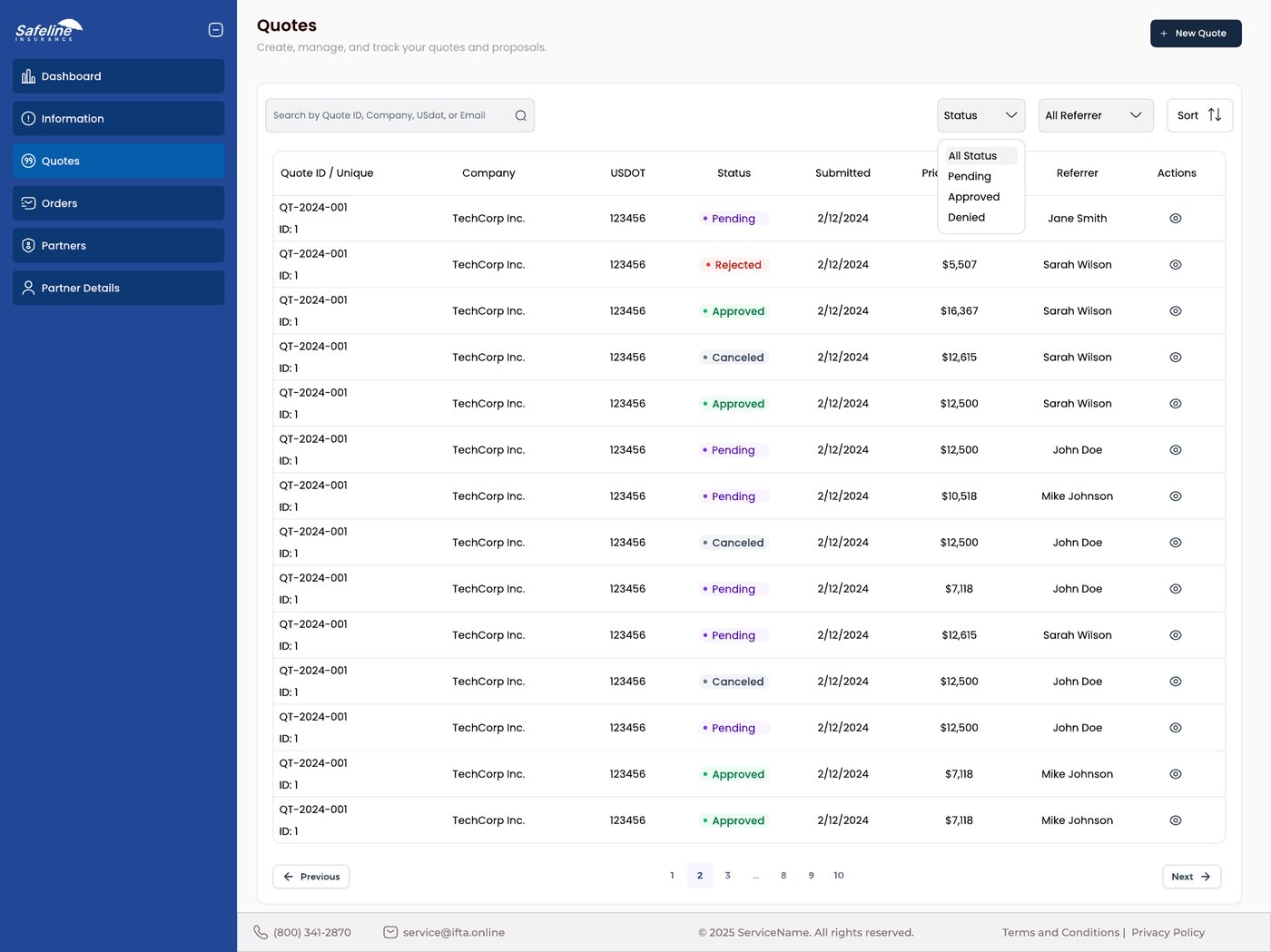
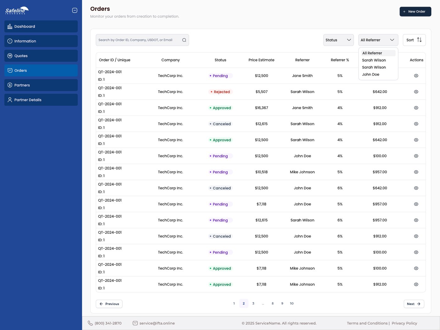
One table pattern for both. Quotes and orders are lists with the same bones: a search box, a status filter, a referrer filter, sorting, and pagination at the bottom. Learn one and you know the other.
Columns that match the stage. The quotes list shows the company, USDOT number, status, submission date and price estimate. The orders list swaps in what matters once a deal is made: the referrer, their percentage, and what they earned.
Status you can scan. Pending, approved, rejected and canceled each get a colored dot and label, so a long list reads by color first.
One detail page, six tabs.
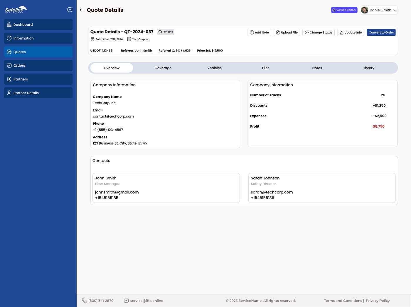
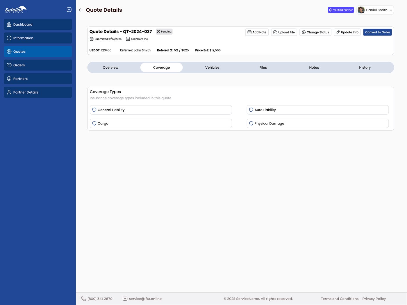
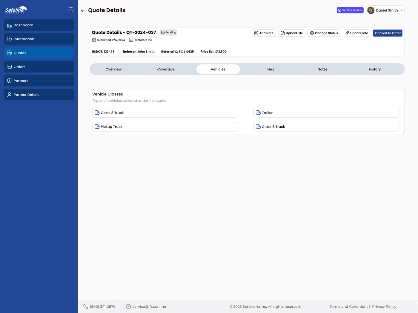
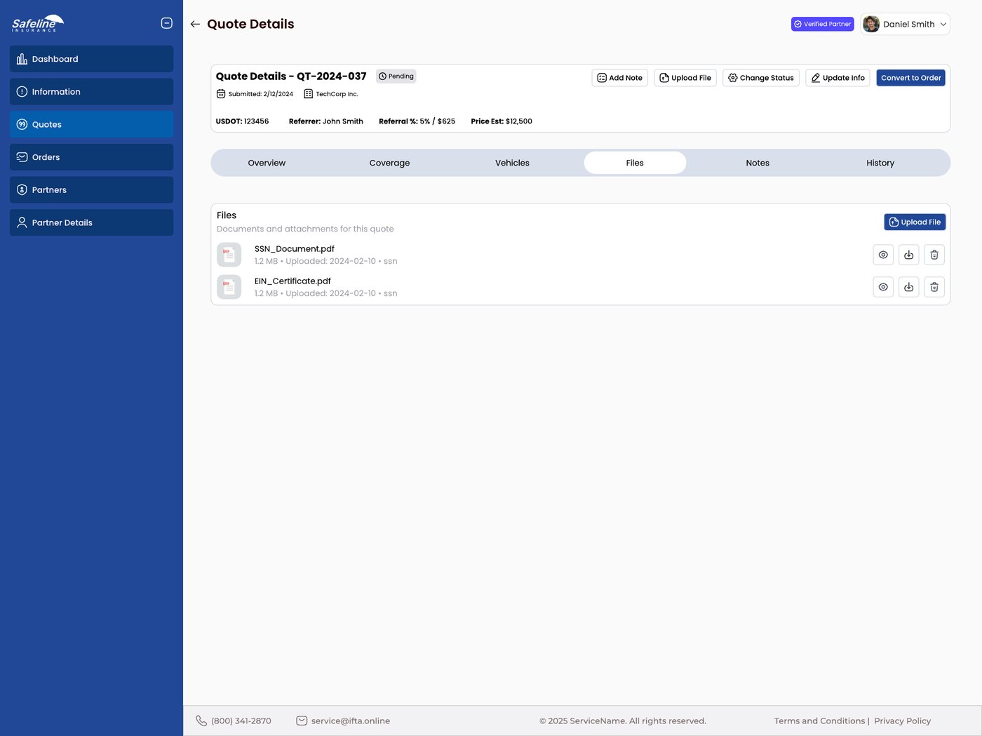
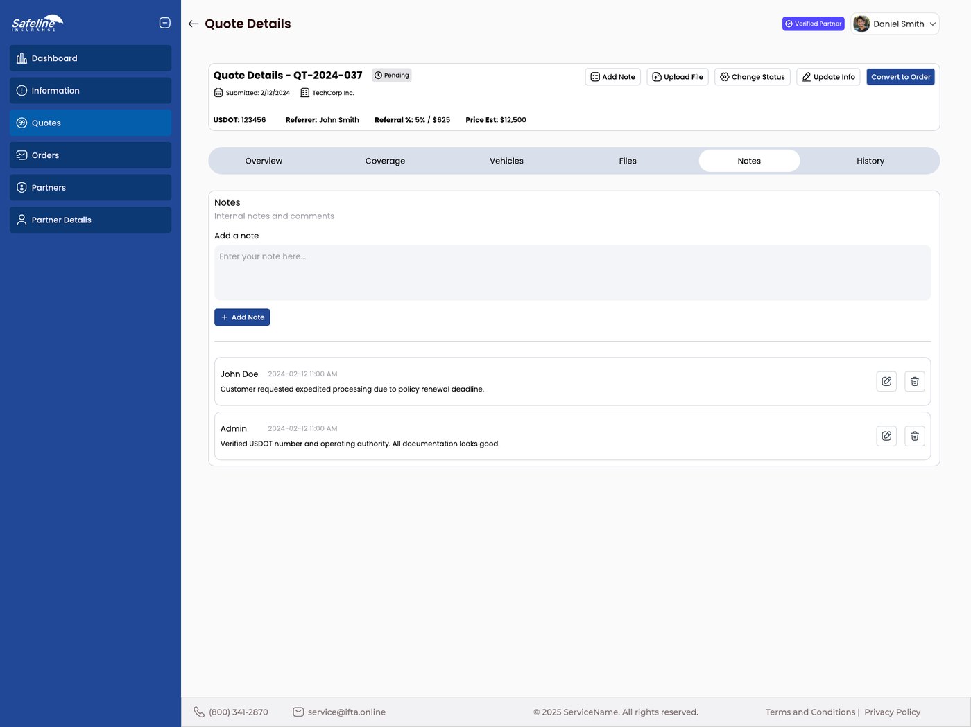
The facts stay on top. The title, status, company, USDOT number, referrer, referral percentage and price estimate sit in a header that never scrolls away, whichever tab is open.
Actions in one place. Add Note, Upload File, Change Status and Update Info are always in the same row. On a quote, Convert to Order joins them as the main action, and it disappears once the quote becomes an order.
Six tabs, one job each. Overview, Coverage, Vehicles, Files, Notes and History split a heavy record into pieces that each fit on one screen.
Money you can follow.
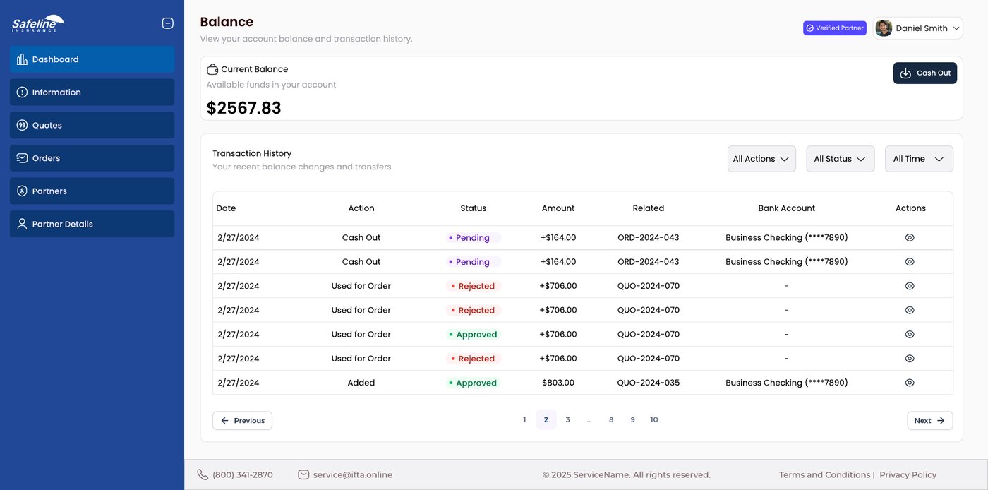
The balance comes first. The current balance is the biggest thing on the page, with a Cash Out button right beside it. Below, a transaction history lists each movement with its date, action, status, amount, the related quote or order, and the bank account used.
Cashing out in one small dialog. It shows the available balance, an amount field with the minimum written under it, and a choice of bank account. Only a verified account can be chosen.
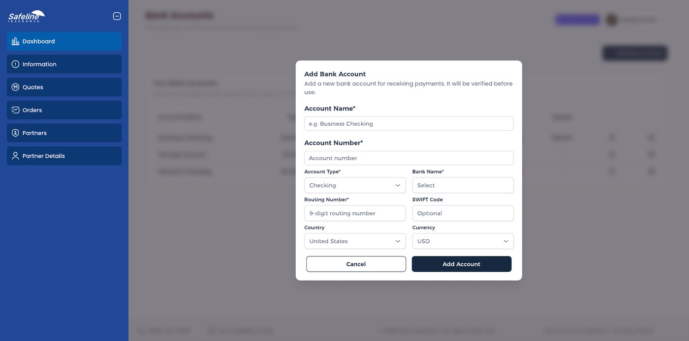
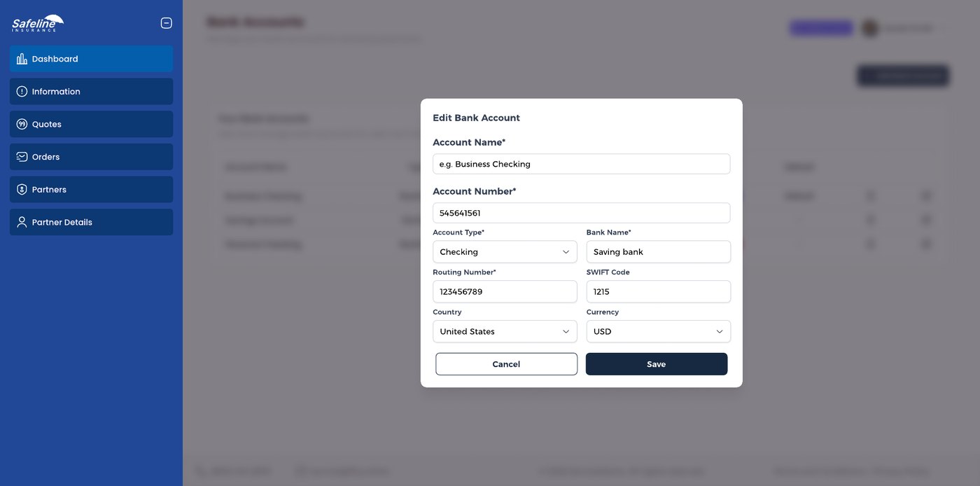
Bank accounts with a clear status. Each account shows Verified, Pending or Rejected, and a default tag. The add and edit dialogs share one form, and tell the user up front that a new account is verified before it can be used.
Settings that build trust.
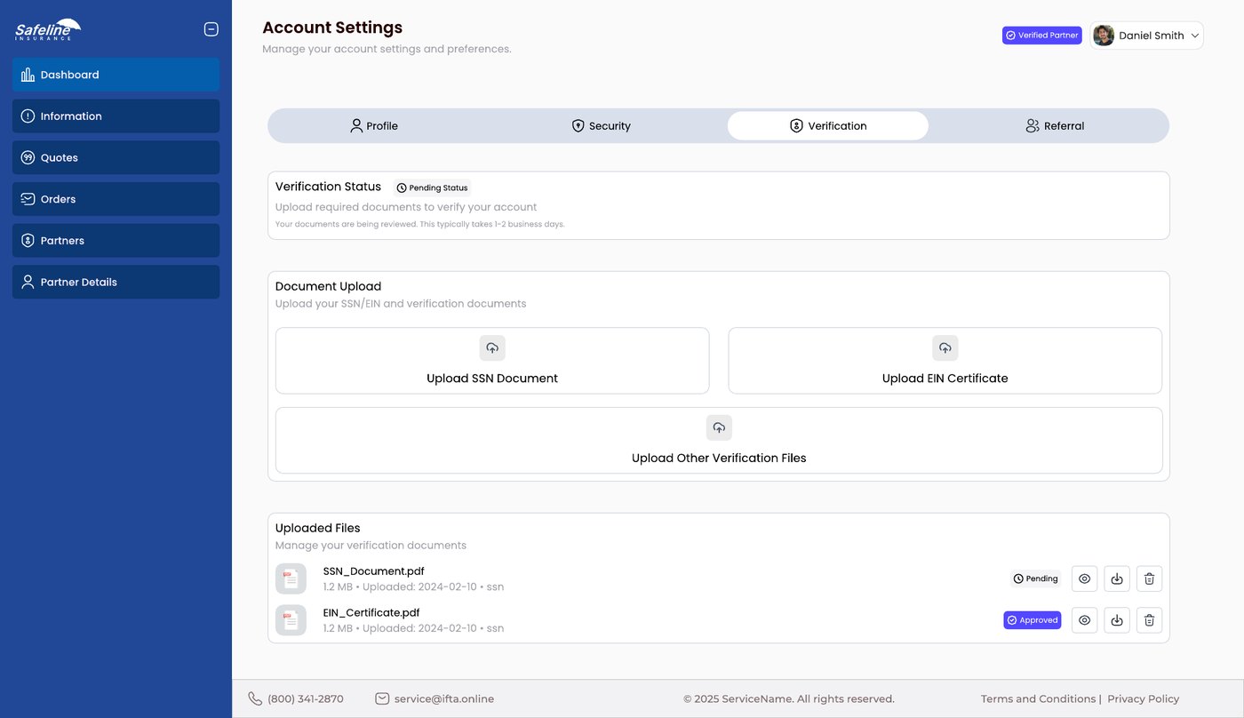
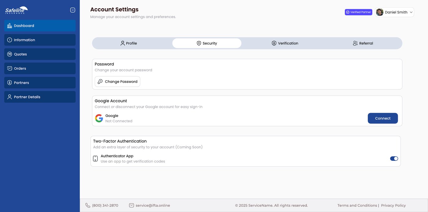
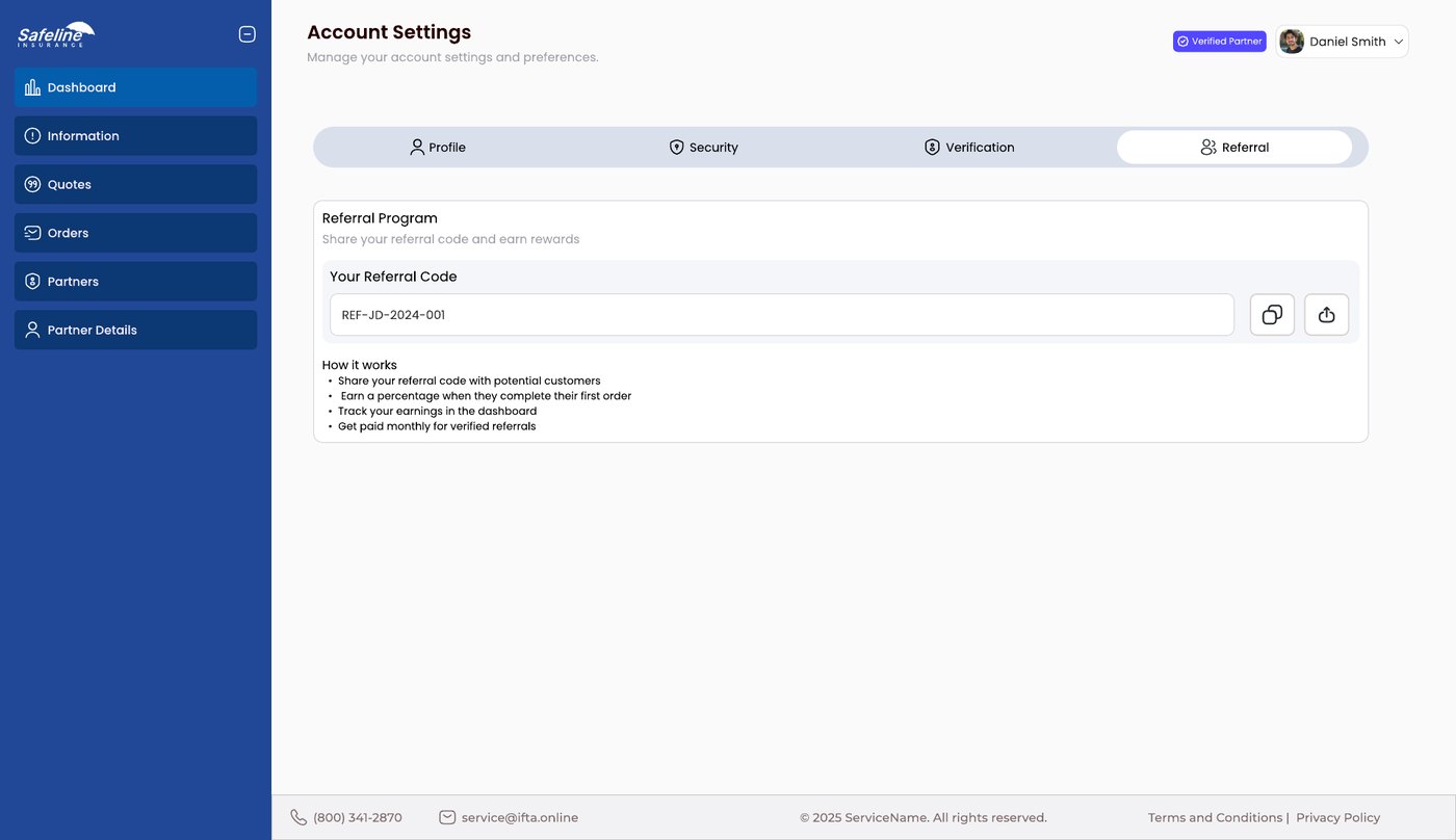
Four tabs. Profile, Security, Verification and Referral sit in one row of tabs, using the same tab style as the detail pages.
Verification as a checklist. A status label at the top says where the account stands. Below it are upload areas for the SSN document, the EIN certificate and other files, then a list of uploads, each marked Pending or Approved, with a note that review takes one to two business days.
Security that is honest. Change password, connect a Google account, and a two-factor option clearly marked as coming soon.
A referral code to copy. The partner's code sits in a field with copy and download buttons, followed by four short lines on how the program works.
How I'd validate it.
These are planned tests, not results. They show how the design would be checked with real users, and what would be measured.
Task test
Ask partners to find the status and the commission of a named order.
Cash out dry run
Have partners complete a cash out with a verified account, and note hesitations.
Tab usage
Observe which of the six tabs people open first, and in what order.
Verification review
Check support requests about verification to improve the wording.