How I framed the project at the start: the goal, the people it serves, and the limits to design within.
Working assumptions, based on the product's purpose and its screens.
← All work
Logix Software
A home page and blog for a software development company, built from clear, repeatable cards.
- Client
- Logix Software
- Platform
- Website
- Scope
- Home page sections and blog page
A software company's site has a lot to say: services, industries, technology, clients, articles. The job was to give each of those a calm, consistent place, so visitors can find what they need at a glance.
The brief.
Goal
Give a software company's website a clear structure, so visitors quickly understand what it does and can get in touch.
Users
Business owners and managers looking for a software partner, comparing a few companies.
Constraints
A lot to say: services, technologies, industries, partners and a blog. It must feel trustworthy, and buyers scan quickly.
Who it's for.
Two proto-personas show the kinds of people the design is built for: what they want, what gets in their way, and what they need from the product.
Proto-personas come from assumptions about the audience, not from interviews. They are meant to be checked with real users.Karen, 38
Operations manager, logistics- Goal
- Find a vendor who can build custom software.
- Frustration
- Vague service pages, and no sign the company knows her industry.
- Needs
- Industry examples, proof of experience and an easy way to get in touch.
Maria, 45
Founder, small business- Goal
- Compare a few companies without much time.
- Frustration
- Jargon and long pages.
- Needs
- Plain language, partner logos and a simple contact.
Follow the journey.
The journey follows one person from start to finish. For each stage it notes what they do, what they might be thinking, and how the design answers it.
Arrive
DoesLands on the home page from search or a referral.
ThinksWhat does this company do?
Design responseA headline, a short intro and three cards.
Understand
DoesScans the welcome cards.
ThinksDo they have real experience?
Design responseCards for testimonials, experience and business intelligence.
Check fit
DoesLooks at technologies and industries.
ThinksDo they work with my stack and my industry?
Design responseA technology grid and eight industry cards.
Build trust
DoesLooks at partner logos and recent articles.
ThinksWho else trusts them?
Design responseA partners grid and a blog preview.
Contact
DoesUses the Contact Us button.
ThinksHow do I reach them?
Design responseContact Us is always a filled button in the menu.
Map the structure.
The structure shows how the screens are grouped, so every function has one clear home and related things sit together.
Logix website
Menu
- Home
- Portfolio
- Services
- Marketing
- Insights
- About Us
- Staff
- Contact Us
Home page
- Welcome and three cards
- Technology
- Industries
- Partners
- Blog and news preview
Insights
- Blog
- News
Footer
- Quick links: About Us, Portfolio, Staff, Insights, FAQs, legal
- Services: development and marketing
The flow and the principles.
The path through the product
- 1Land on the home page
- 2Learn what Logix does
- 3Browse technology and industries
- 4See partners as proof
- 5Read the blog
- 6Contact Logix
Principles behind the decisions
Visual hierarchy
Large headlines, short intros and one button per section tell visitors where to look next.
Chunking and consistency
Eight technologies and eight industries each use one card pattern, so scanning is fast.
Social proof
Partner logos sit right after the offer, where doubts usually start.
Clear wayfinding
The current page is highlighted in the menu, and Contact Us is always a filled button.
From problems to answers.
Each assumed problem has a specific answer in the design. The screens that follow show them in detail.
Problem: Too much to say on one pageSections with one headline, one intro and one repeating pattern each.
Problem: Visitors can't tell if the company fits their industry or stackAn industry card pattern and a technology grid.
Problem: Trust is hard to build onlinePartner logos and a blog, placed right after the offer.
Say who they are, then show proof.
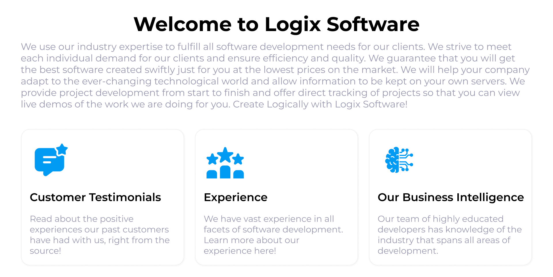
A welcome with three doors. A bold headline and a short introduction lead into three cards: testimonials, experience, and business intelligence. Each has an icon, a title, and one line, so visitors choose where to go next.
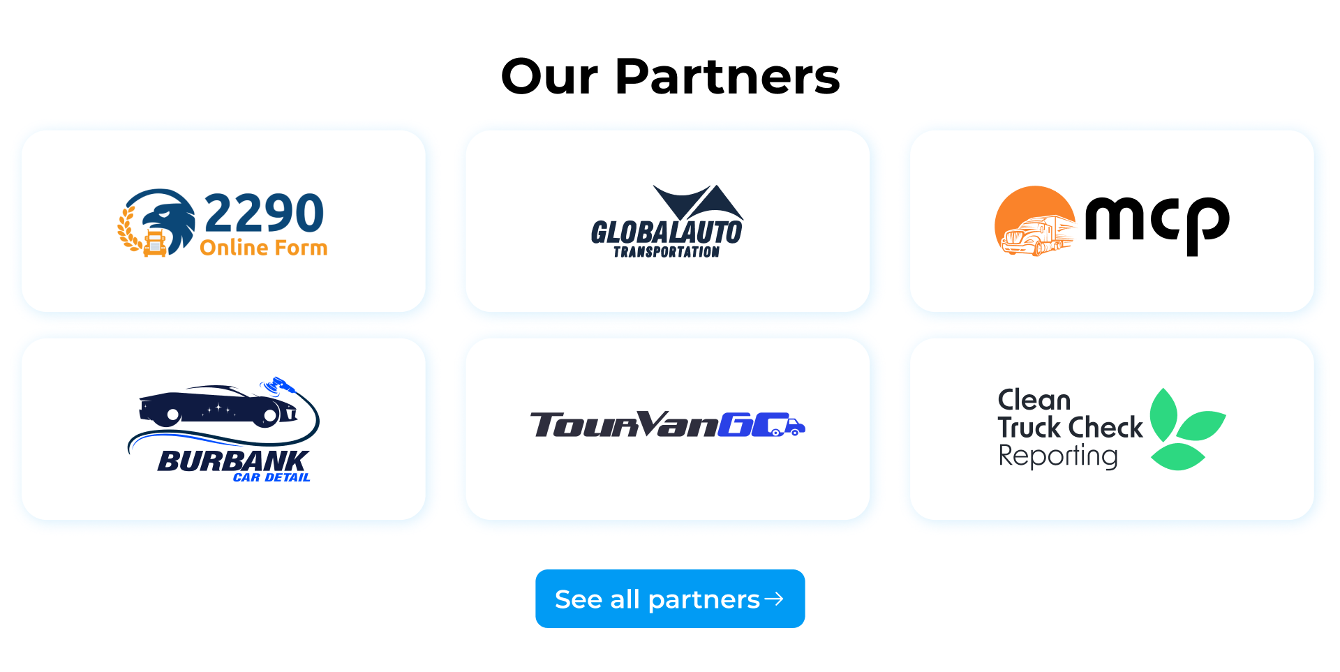
Partners on plain white cards. The partner logos sit in an even grid of white cards, so very different logos, some colorful and some black, look balanced. A single button leads to the full list.
Make a technical offer easy to scan.
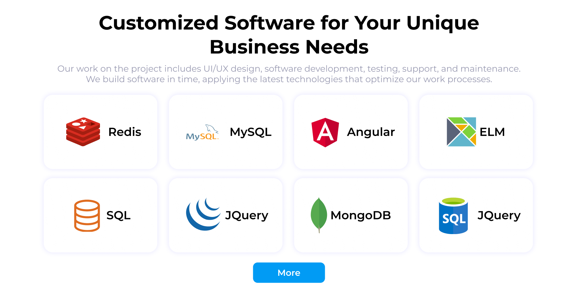
Technology as a tidy grid. Eight logo cards, four across, with the name next to each logo. One More button holds the rest, so the page stays short.
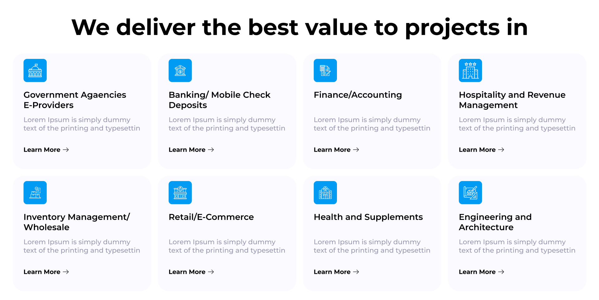
One card pattern for industries. Each industry gets the same card: a blue icon tile, a title, a short description, and a Learn More link. Because the card never changes, visitors can scan eight of them in seconds.
Keep the blog in the same system.
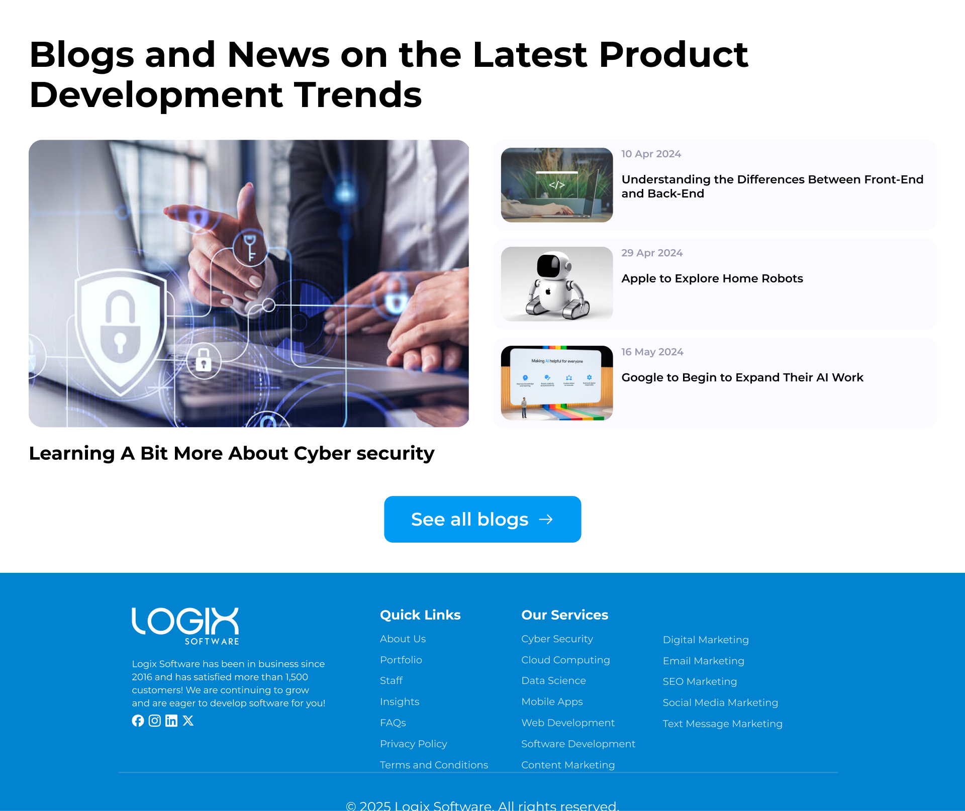
A featured story and a short list. On the home page, one large article leads, with three smaller ones beside it showing a date and a title. A See all blogs button goes to the full page.
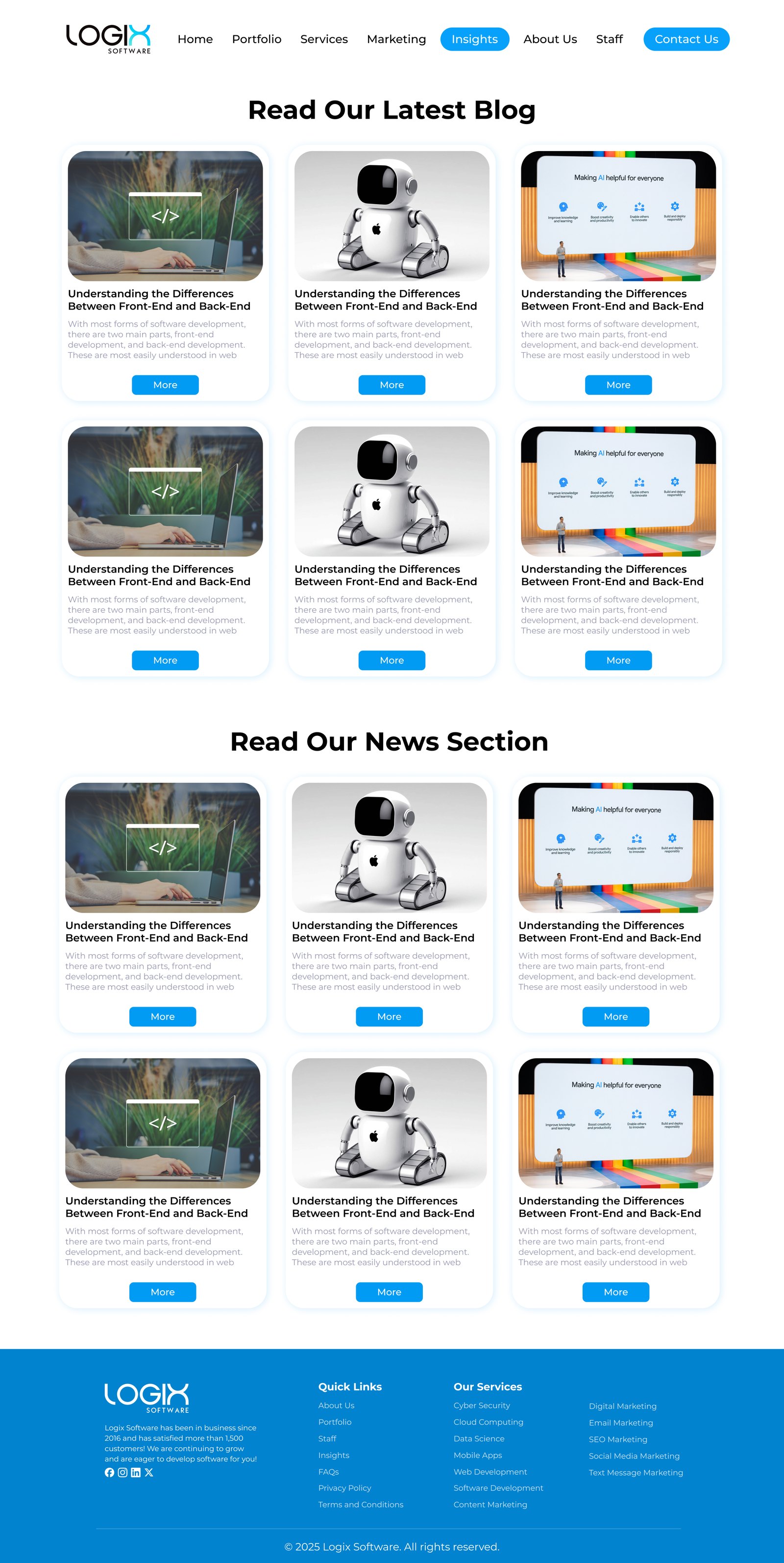
Blog and news, side by side in structure. The blog page has two sections, Blog and News, each a three-column grid of the same card: image, title, short intro, and a More button.
Navigation that shows where you are. The current page is a filled blue pill, and Contact Us is always a filled button. The footer repeats the quick links and services in tidy columns.
One blue, one card.
One accent color. A single bright blue is used for buttons, icon tiles, the active menu item and the footer, so the eye always knows what is clickable.
One card shape. Rounded corners and a soft shadow are used on every card, from services to partners to articles. New sections can be added without a new visual language.
How I'd validate it.
These are planned tests, not results. They show how the design would be checked with real users, and what would be measured.
Five-second test
Show the home page for five seconds and ask what the company does.
Click test
Ask where people would click to learn about industries, and where to contact.
Click tracking
Track clicks on Contact Us and the industry cards.
Blog entry points
Check whether visitors reach articles from the home page preview.