How I framed the project at the start: the goal, the people it serves, and the limits to design within.
Working assumptions, based on the product's purpose and its screens.
← All work
Evoca digital gift card
A four-step flow for ordering a digital gift card and scheduling it to be sent to someone else, designed for web, tablet and mobile.
- Client
- Evoca
- Platforms
- Web, tablet, mobile
- Scope
- Ordering flow and error states
Buying a gift for someone else means collecting a lot of information: whose card, how much, who it's for, when it arrives. The flow breaks that into four short steps, and a progress line at the top always shows where you are.
The brief.
Goal
Let someone order a digital gift card and schedule it to reach another person, on any device.
Users
Bank customers who want to give a gift, mostly from a phone.
Constraints
The receiver must be a resident of Armenia and a user of the EvocaTOUCH app. Fees and amount limits apply. The flow has to work on web, tablet and mobile.
Who it's for.
Two proto-personas show the kinds of people the design is built for: what they want, what gets in their way, and what they need from the product.
Proto-personas come from assumptions about the audience, not from interviews. They are meant to be checked with real users.Lilit, 27
Marketing specialist- Goal
- Send a birthday gift to a friend on the right day.
- Frustration
- Long forms and hidden fees.
- Needs
- A nice card, quick amounts and scheduling.
Armen, 41
Business owner- Goal
- Send gift cards to employees or partners without visiting a branch.
- Frustration
- Not knowing the rules, like limits or who can receive.
- Needs
- Clear rules up front and a summary before confirming.
Follow the journey.
The journey follows one person from start to finish. For each stage it notes what they do, what they might be thinking, and how the design answers it.
Theme
DoesBrowses the gift card themes.
ThinksWhich card suits this person?
Design responseA large carousel, with the chosen theme enlarged.
Design and amount
DoesPicks a currency and an amount.
ThinksHow much can I send, and what will it cost?
Design responseReady amounts, a custom amount, and the fee and range under the field.
Details
DoesEnters their own details and the receiver's name.
ThinksCan this person actually receive it?
Design responseThe resident rule is stated beside the receiver.
Send options
DoesChooses email or SMS, a date and a time.
ThinksWill it arrive at the right moment?
Design responseCalendar and time pickers, with GMT+4 shown.
Confirm
DoesReads the warning and the summary, then confirms.
ThinksIs everything correct?
Design responseA dialog about EvocaTOUCH, then a receipt-like summary.
Map the structure.
The structure shows how the screens are grouped, so every function has one clear home and related things sit together.
Gift card flow
Step 1: Theme
- Theme carousel
- Continue
Step 2: Design
- Card preview
- Currency
- Amount: ready or custom
- Fee and range
Step 3: Details
- Giver: name, ID, email, phone
- Receiver: name
- Resident note
Step 4: Send
- Method: email or SMS
- Date and time (GMT+4)
- Recipient contact, repeated
- Message and terms
Confirm
- EvocaTOUCH dialog
- Summary
- Confirm
Always there
- Phone number
- Language
- History (web)
The flow and the principles.
The path through the product
- 1Choose a theme
- 2Set design and amount
- 3Enter giver and receiver details
- 4Choose how and when to send
- 5Check and confirm
- 6Review the summary
Principles behind the decisions
Visibility of progress
A four-step progress line always shows where you are and how much is left.
Error prevention and recovery
Rules are stated before they matter (fee, amount range, resident note), and errors appear right under the field.
Flexibility
Ready amounts for speed, a custom amount for control.
Consistency across devices
The same steps, order and wording on web, tablet and mobile.
From problems to answers.
Each assumed problem has a specific answer in the design. The screens that follow show them in detail.
Problem: A long form feels like workFour short steps with a progress line.
Problem: Surprises at the end: fees, limits, who can receiveThe fee, the range and the resident rule are stated before they matter.
Problem: Typos when typing contactsRepeat fields for email and phone, with errors right under the field.
Pick a design, then an amount.
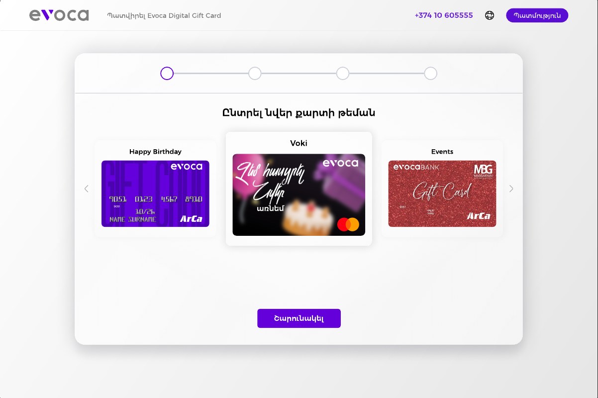
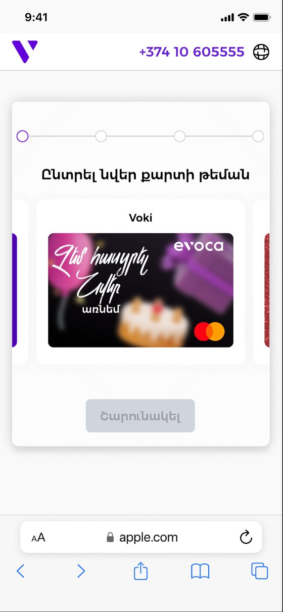
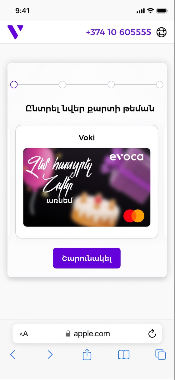
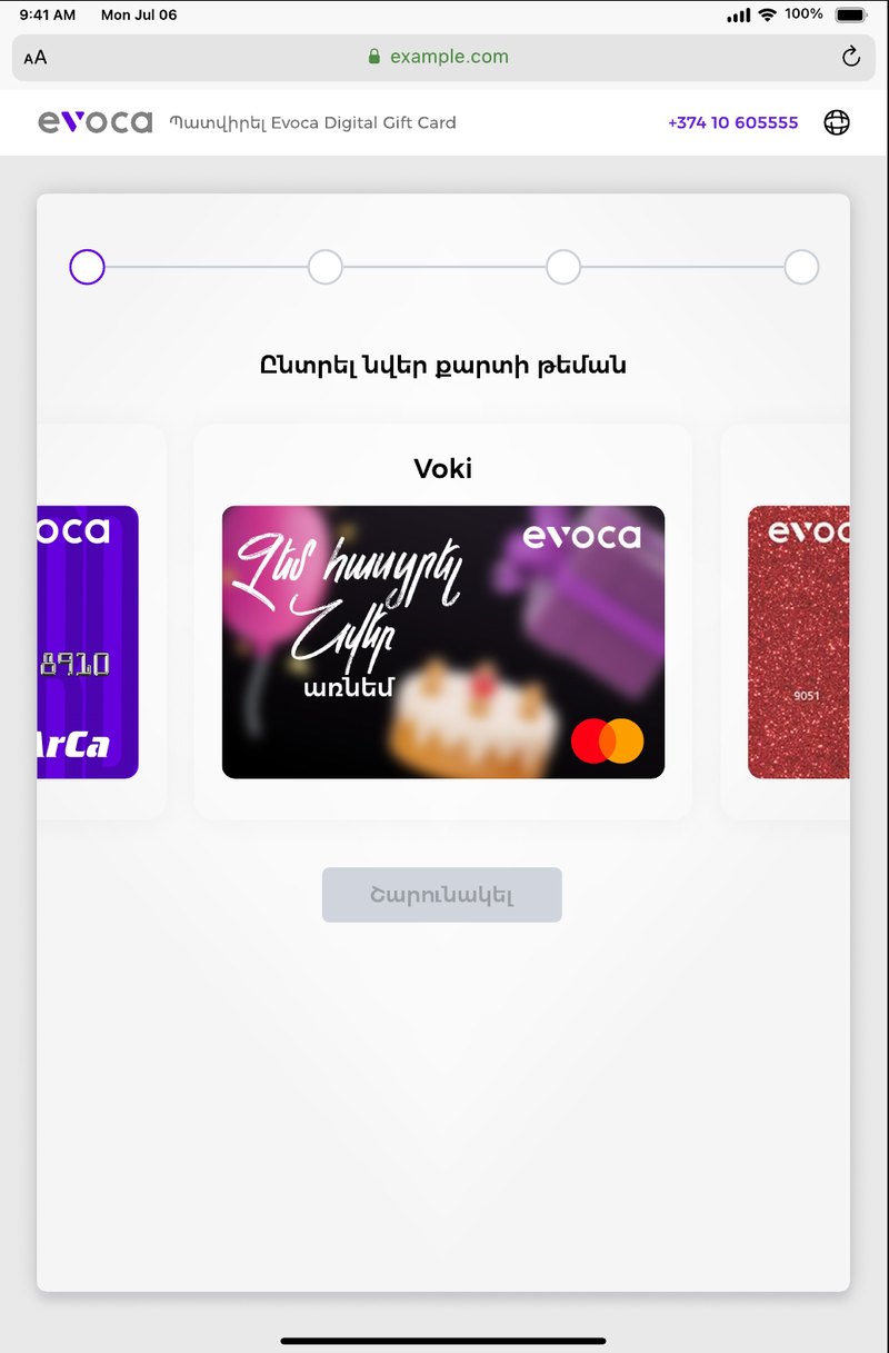
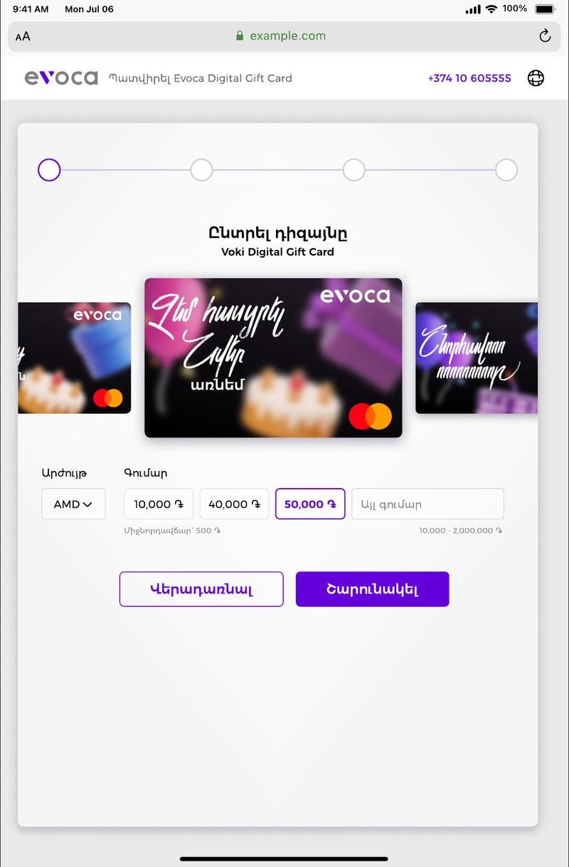
Themes in a carousel. The gift card themes sit in a row, and the one you pick is enlarged with a border around it. The Continue button stays grey until a theme is chosen, so it's clear what has to happen first.
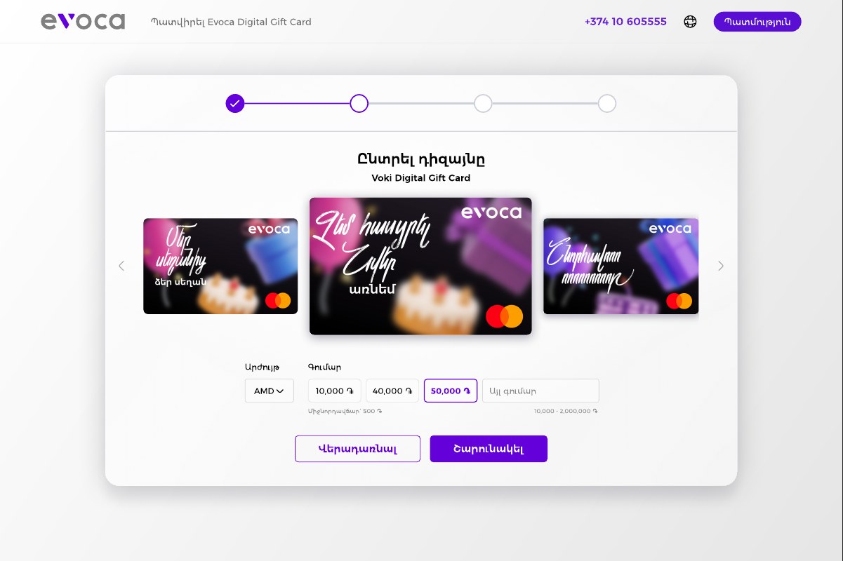
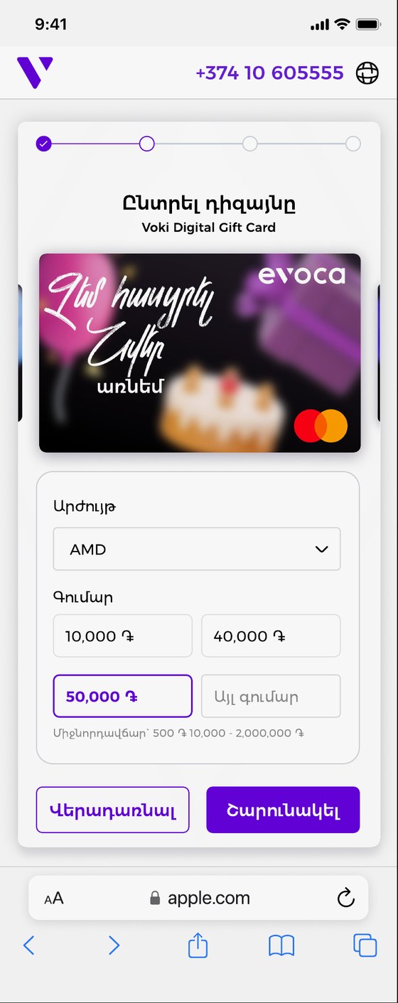
Amounts without typing. Choose a currency, then tap one of three ready amounts, or type your own. The fee and the allowed range, 10,000 to 2,000,000 ֏, are written directly under the amount fields, before the person has to ask.
Ask for details in plain groups.
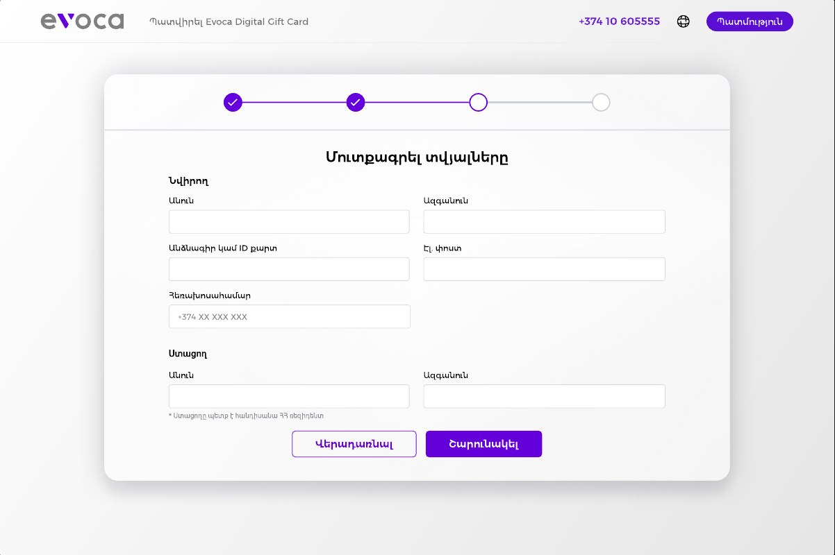
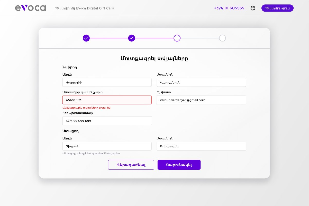
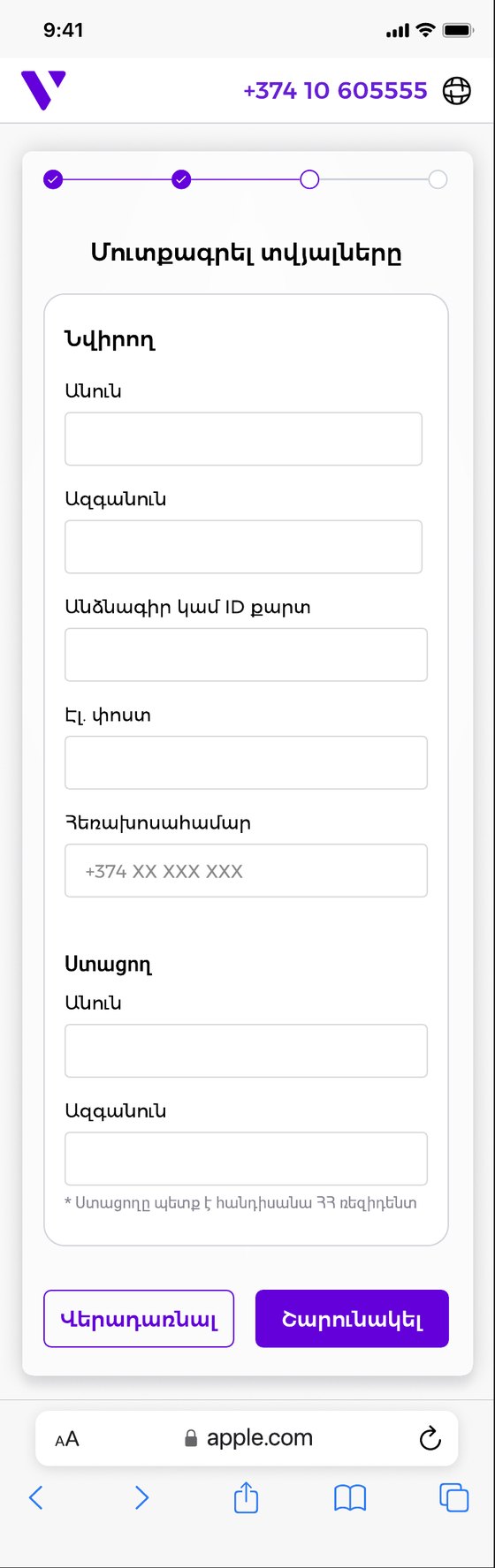
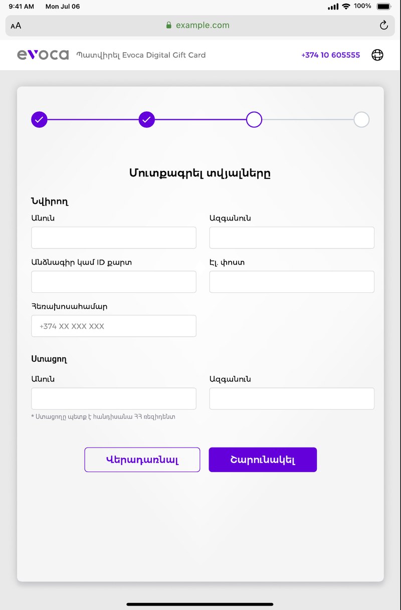
Giver first, then receiver. The form has two clear groups: the person sending the gift, with name, ID or passport, email and phone, and the person receiving it, with just a name and surname.
The rule is stated up front. A small note under the receiver's name says the receiver must be a resident of Armenia, so no one fills in the form and finds out at the end.
Two columns on large screens, one on small ones. On the web the fields sit side by side. On a phone they stack, with the same order and the same labels.
Choose how and when it arrives.
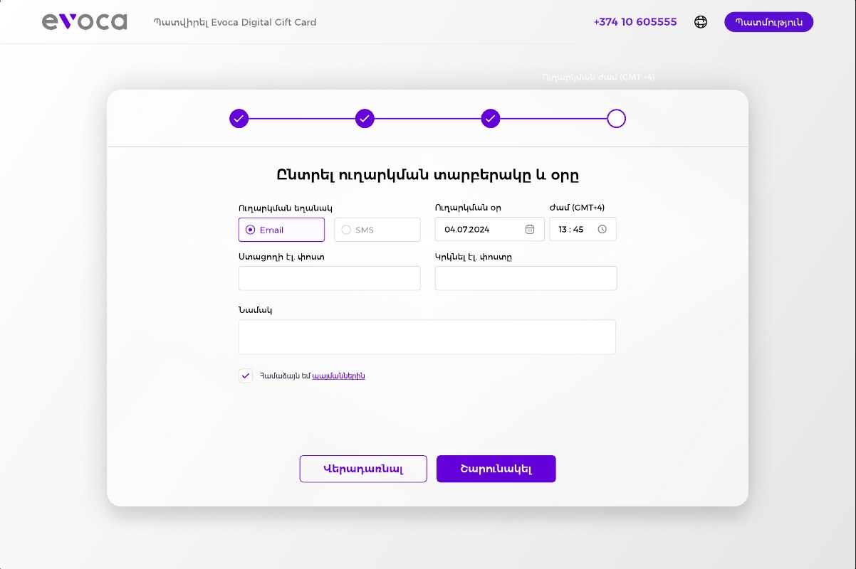
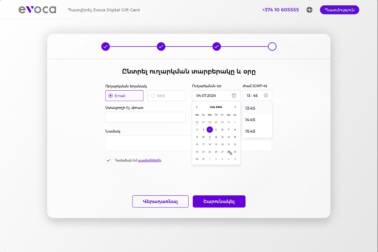
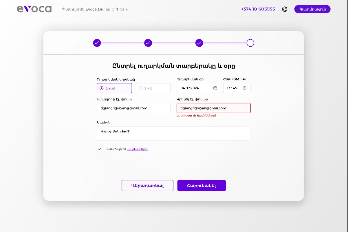
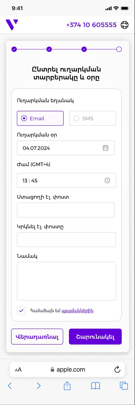
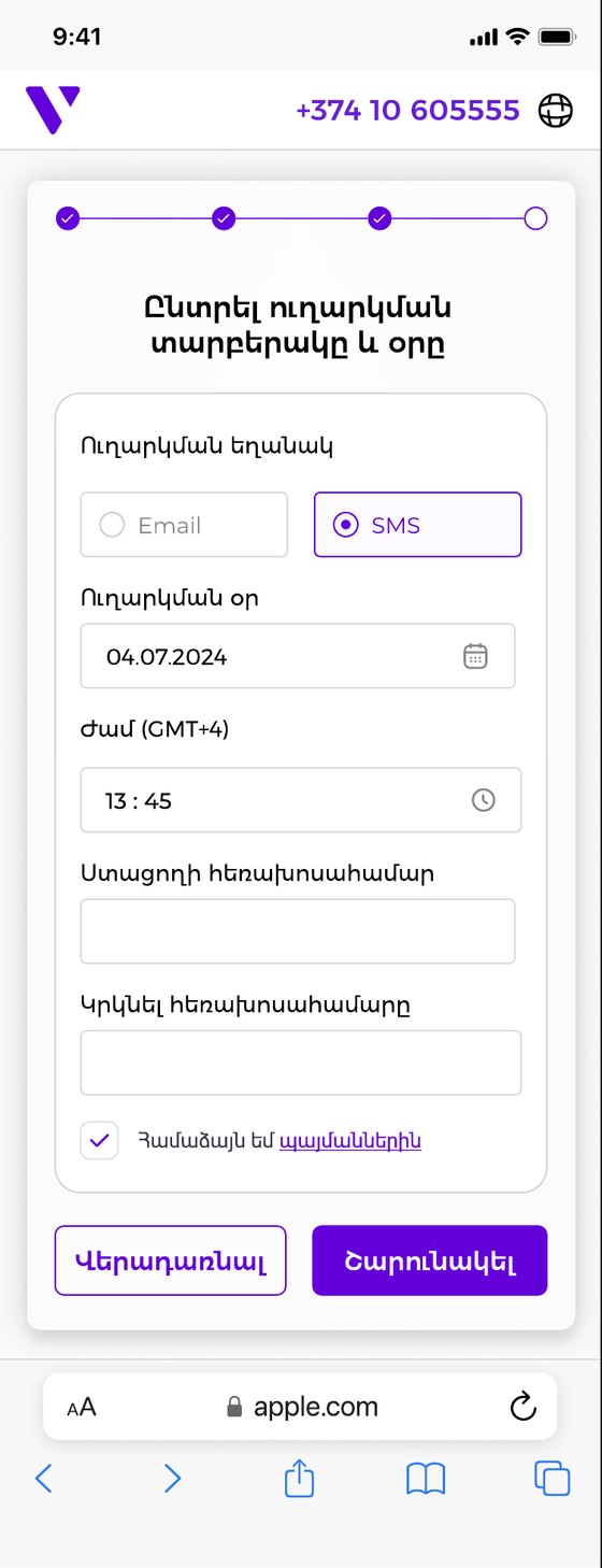
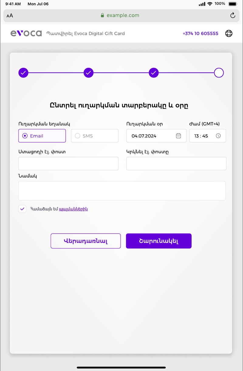
Email or SMS, one toggle. Switching the sending method swaps the fields below it: email, repeat email and a message, or a phone number and a repeat phone number. Only the relevant fields are ever on screen.
A real date and time. The send date and the time, shown in GMT+4, open a calendar and a time list, so the gift can be scheduled for exactly the right moment.
Terms at the end of the step. An agreement checkbox with a link to the terms sits right above the buttons, where people expect it.
Check everything before it's sent.
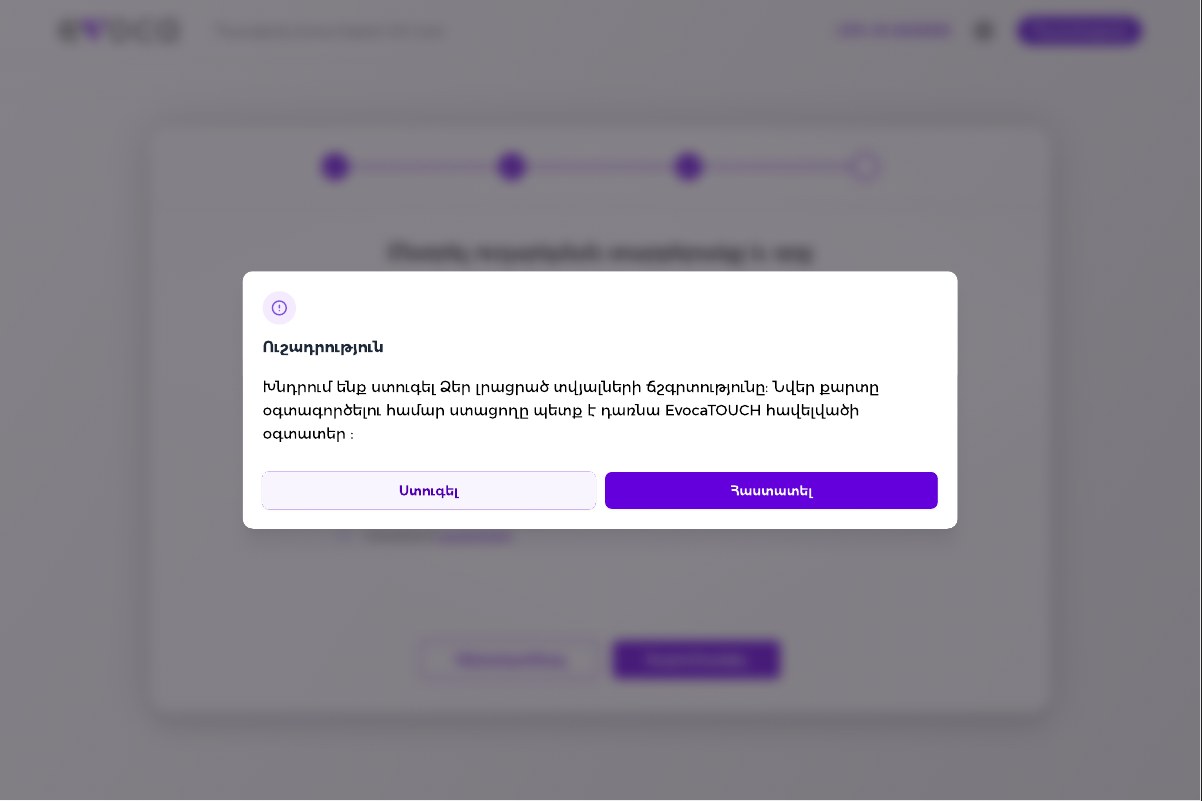
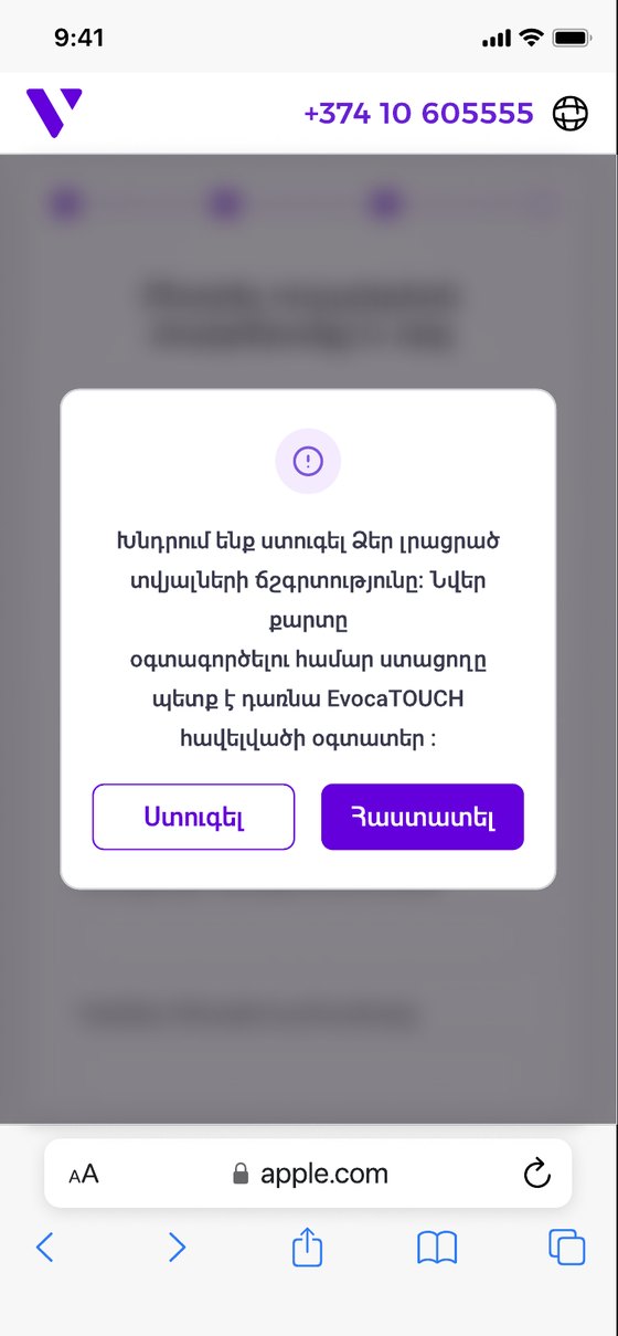
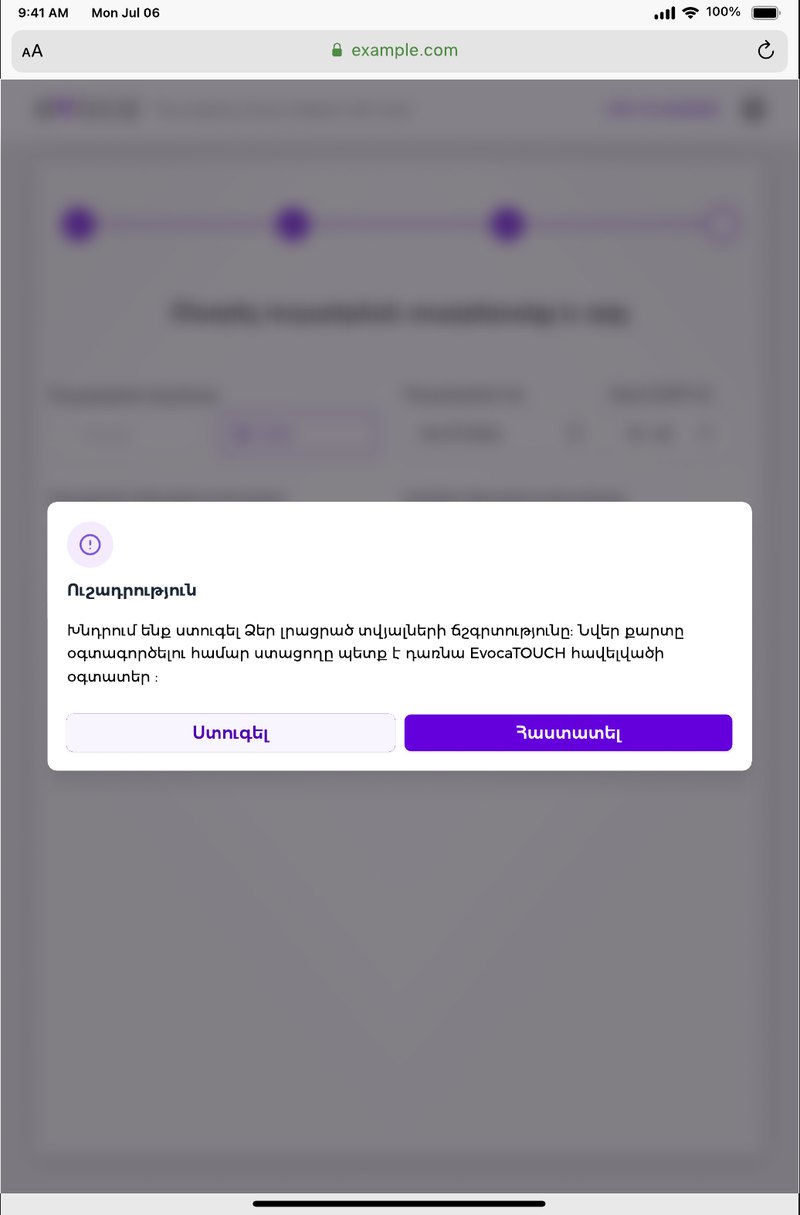
One important warning, once. A dialog asks the person to check their details and explains the one condition: to use the gift card, the receiver must become a user of the EvocaTOUCH app. Check and Confirm are the two choices.
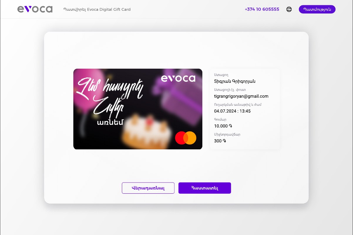
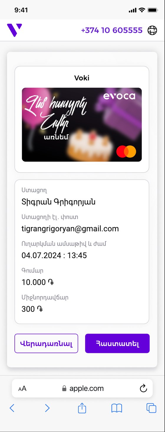
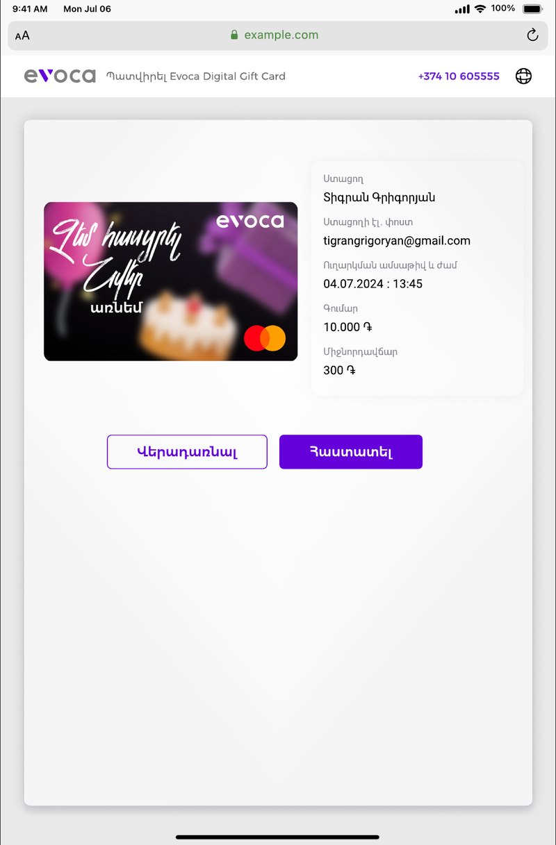
A summary that reads like a receipt. The final screen shows the card, the receiver, their email, the date and time, the amount and the fee, with Back and Confirm underneath.
Errors that explain themselves.
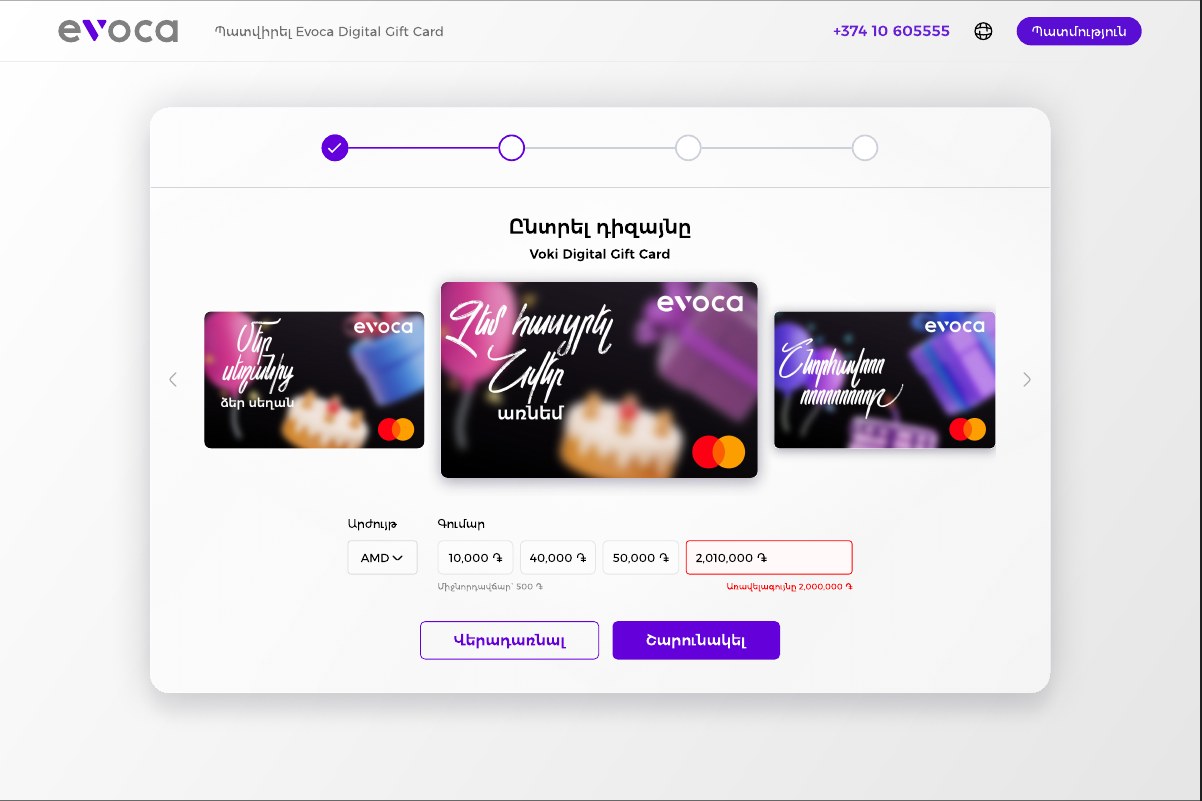
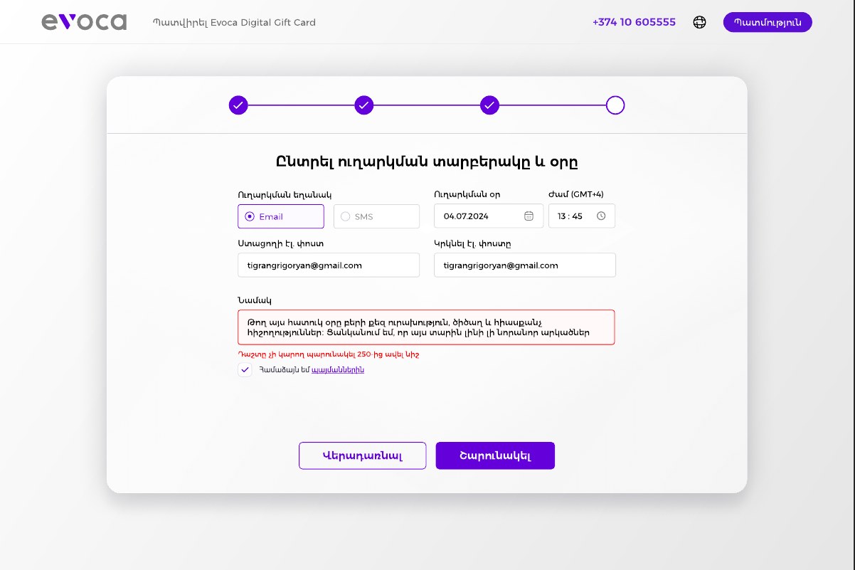
Right where the problem is. A field with a problem gets a red border and a short message directly underneath it, so there's no hunting through the form.
The common mistakes are covered. An amount outside the allowed range, an ID number that doesn't fit, an email address typed twice differently, and a message that is too long each have their own state.
The same flow on every screen.
One path, three layouts. The steps, the order and the wording stay the same on web, tablet and mobile. Only the arrangement changes: cards stack, two columns become one, and the buttons stay at the bottom of each card.
Contact always in reach. The phone number and the language switch stay in the top bar on every size.
Mobile
Tablet
How I'd validate it.
These are planned tests, not results. They show how the design would be checked with real users, and what would be measured.
Usability test
Watch five people order a card from start to finish, and note where they hesitate.
Error review
Count which error messages appear most often, and improve those fields.
Device comparison
Compare completion between web, tablet and mobile.
Wording test
Ask people to explain the EvocaTOUCH warning in their own words.