How I framed the project at the start: the goal, the people it serves, and the limits to design within.
Working assumptions, based on the product's purpose and its screens.
← All work
Evocabank installments
A web portal for submitting installment loan applications on a customer's behalf and following each one through to a decision.
- Client
- Evocabank
- Platform
- Web portal
- Scope
- Application flow and design system
The people using this portal fill in applications all day. So it has to be fast to start, hard to get wrong, and clear about where every application stands.
The brief.
Goal
Let a member of staff submit an installment application for a customer quickly and correctly, then follow it through to a decision.
Users
Staff who enter applications on behalf of customers, often many a day, working in Armenian.
Constraints
Customer data must be right the first time. Applications end in several different outcomes. Speed matters more than decoration.
Who it's for.
Two proto-personas show the kinds of people the design is built for: what they want, what gets in their way, and what they need from the product.
Proto-personas come from assumptions about the audience, not from interviews. They are meant to be checked with real users.Anna, 29
Sales assistant, partner store- Goal
- Submit an application while the customer waits at the counter.
- Frustration
- Retyping data, and not knowing whether an application went through.
- Needs
- A short form, clear errors and a quick way to check the status.
Davit, 34
Branch operator- Goal
- Follow up on the morning's applications and deal with unfinished ones.
- Frustration
- Duplicate or half-finished applications.
- Needs
- Filters, search by customer value and one clear status per application.
Follow the journey.
The journey follows one person from start to finish. For each stage it notes what they do, what they might be thinking, and how the design answers it.
Sign in
DoesOpens the portal and signs in with email and password.
ThinksI want to start right away.
Design responseA short sign-in with a remember-me option.
Start
DoesPicks the loan type and checks the terms.
ThinksWhat are the conditions for this customer?
Design responseThe terms link sits right under the loan type.
Enter data
DoesTypes the ID number, social card, phone and optional email.
ThinksDid I get every field right?
Design responseOne page, clear labels, the optional field marked, consent at the end.
Send
DoesSends the application, or cancels an unfinished one.
ThinksIs there already an application for this customer?
Design responseA dialog catches an unfinished application first.
Track
DoesSearches by date, value or user and opens an application.
ThinksWhere does this application stand?
Design responseColor-coded status labels, filters, refresh and view actions.
Map the structure.
The structure shows how the screens are grouped, so every function has one clear home and related things sit together.
Installment portal
Sign in
- Email and password
- Remember me
- Forgot password
New application
- Loan type and terms link
- Customer details
- Consent
- Send application
- Unfinished application dialog
Applications
- Filters: date range, search, user
- Table with status
- Row actions: refresh, view
- Pagination
Account
- Signed-in user
- Log out
The flow and the principles.
The path through the product
- 1Sign in
- 2Start a new application
- 3Enter loan type and customer details
- 4Resolve an unfinished application
- 5Send the application
- 6Track it in the list
- 7Open or refresh the status
Principles behind the decisions
Error prevention
A dialog catches an existing unfinished application before a duplicate is made, and the terms can be read before any data is collected.
Visibility of status
Five colored status pills show where every application stands, so a long list reads by color first.
Consistency
Inputs, buttons and dialogs come from one small design system with every state defined.
Efficiency for frequent users
Date range, search and user filters, plus two actions per row, serve people who handle many applications a day.
From problems to answers.
Each assumed problem has a specific answer in the design. The screens that follow show them in detail.
Problem: Data entered wrongly at the counterOne short page with clear labels, the optional field marked, and consent at the end.
Problem: Duplicate or half-finished applicationsA dialog asks whether to cancel the unfinished one before a new one starts.
Problem: No quick way to see where an application standsFilters, search and five color-coded statuses.
Sign in, then start an application.
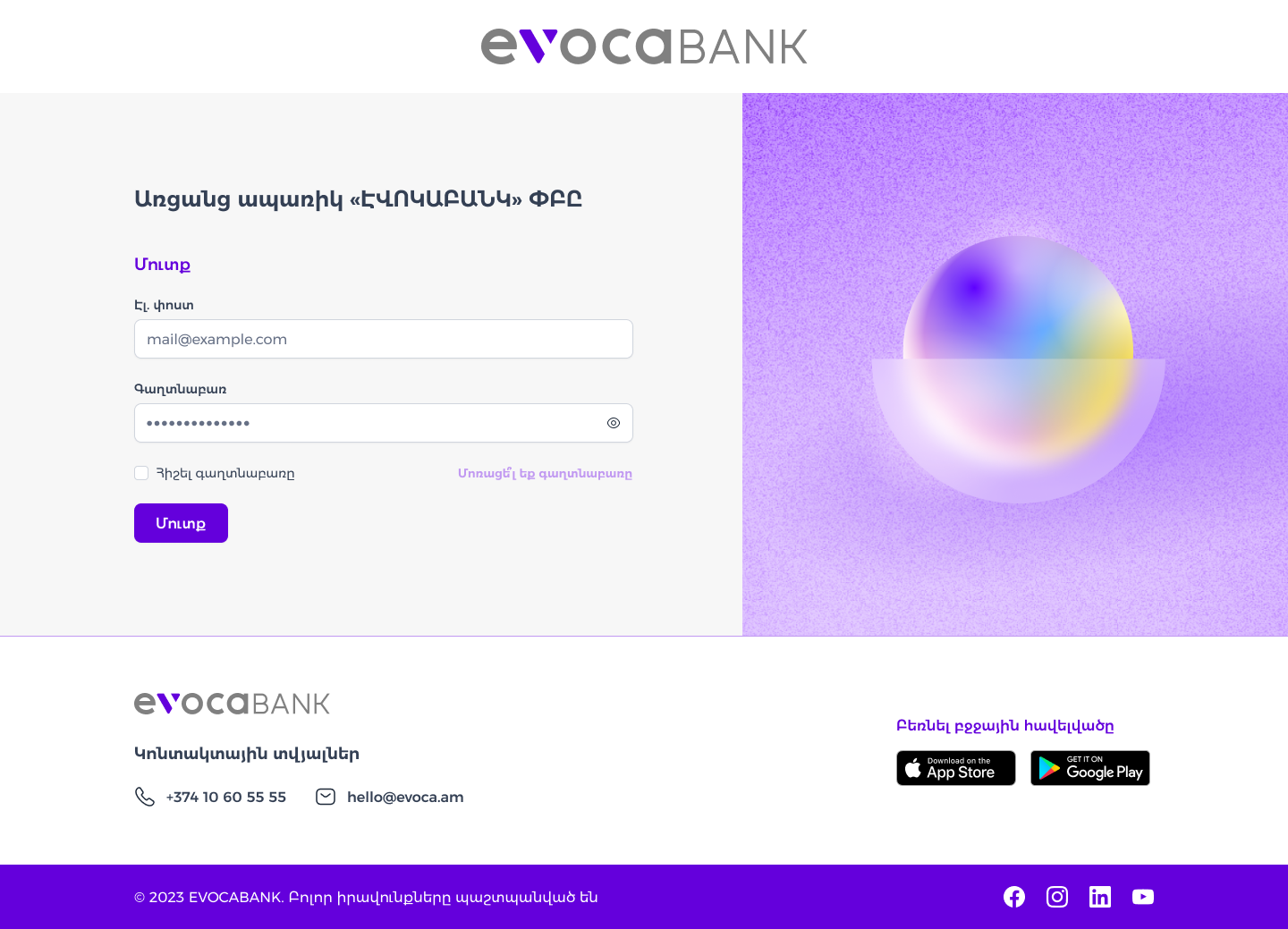
A short sign-in. Email, password, a remember-me checkbox, and one button. The bank's purple illustration fills the other half of the screen, so the portal feels like part of the bank.
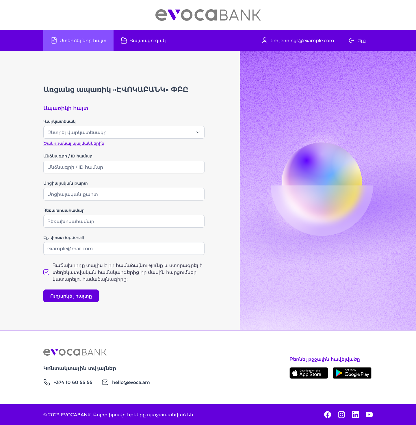
One page, top to bottom. A new application asks for the loan type, ID number, social card, phone number, and an optional email, then a consent checkbox and a single Send button. The one optional field says so in its label.
Terms before details. A link to the loan conditions sits right under the loan type, so they can be read before any customer data is collected.
See every application at a glance.
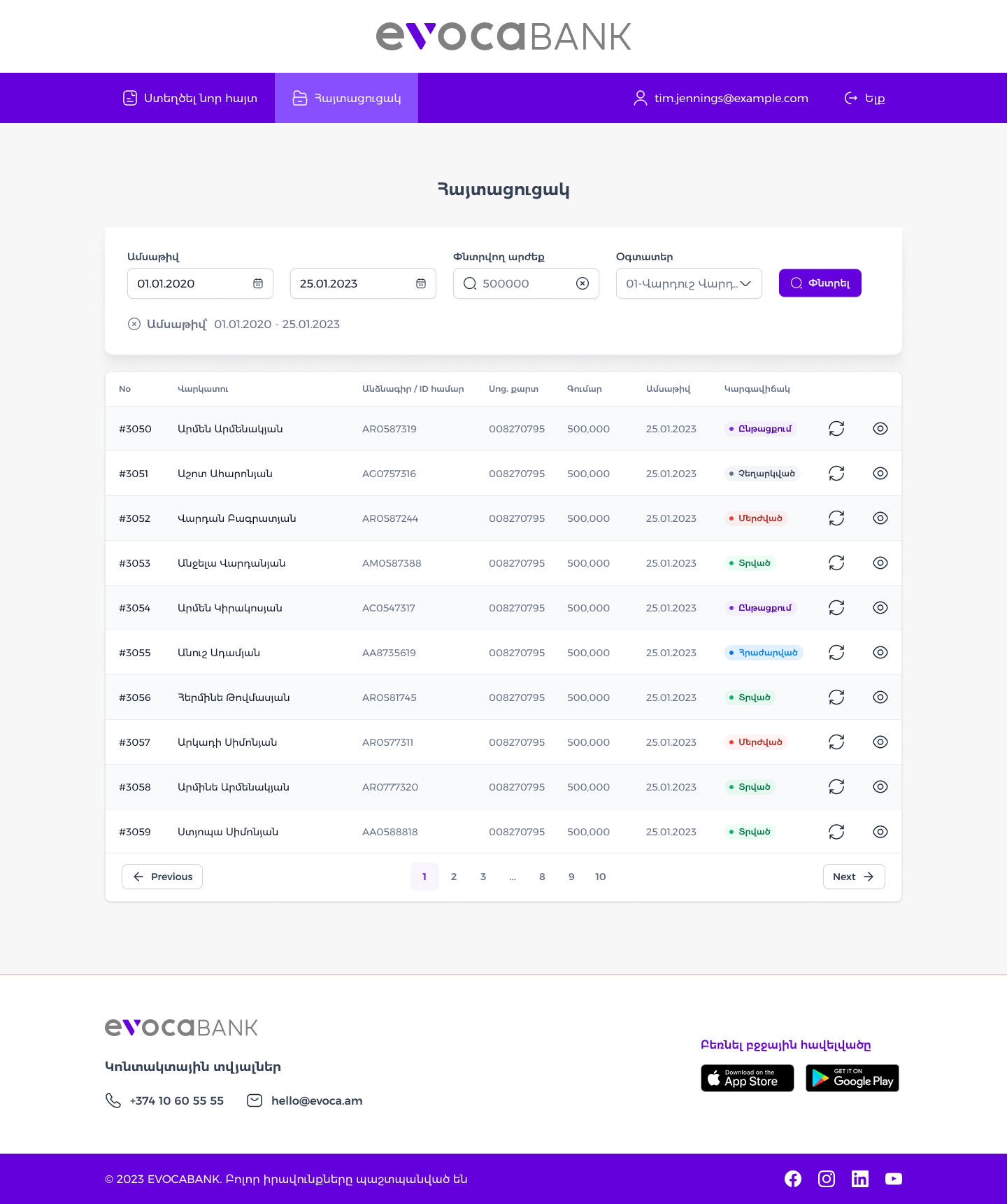
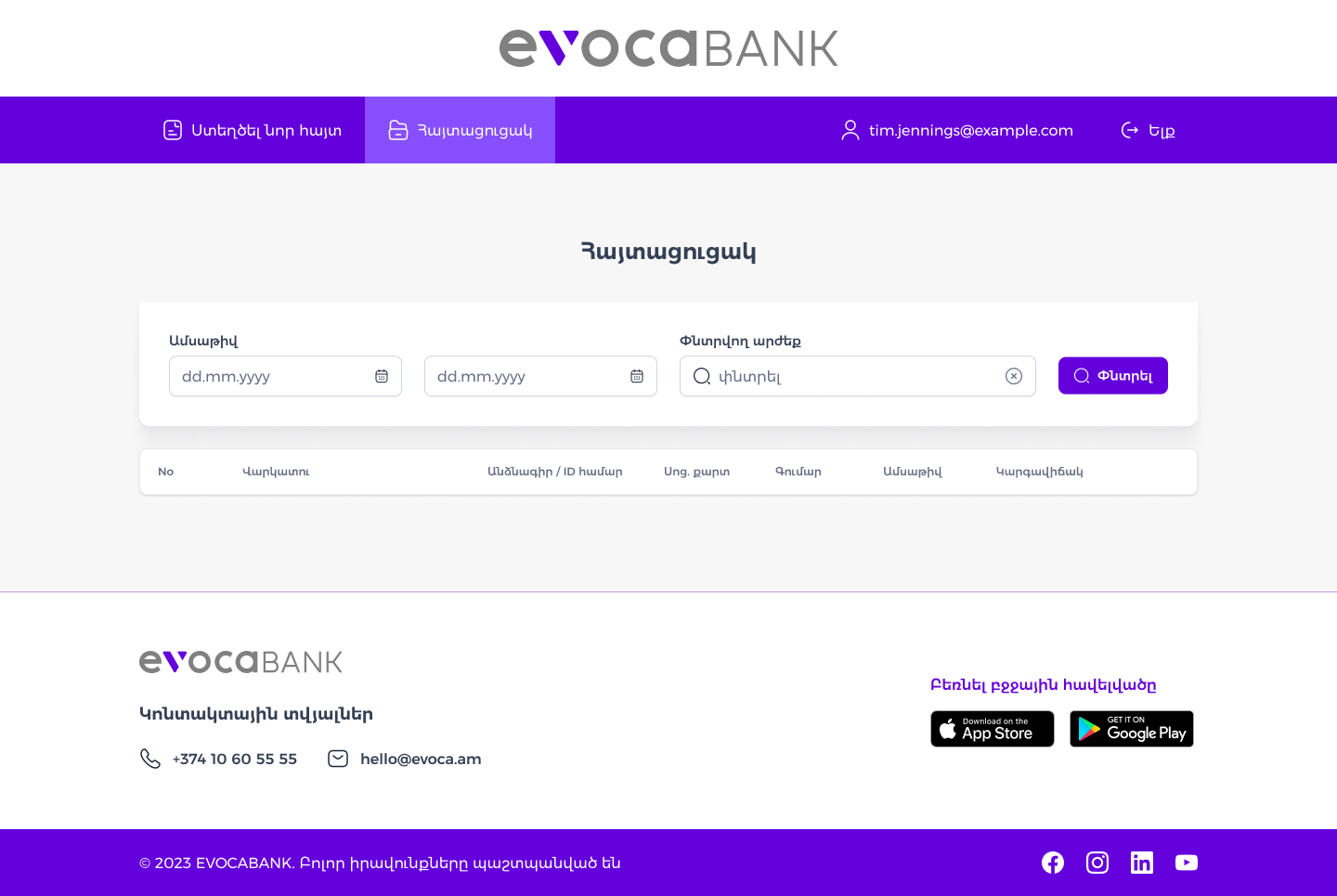
Filters that show themselves. Filter by date range, search by a value, or narrow to one user. Applied filters appear as a small chip under the form, with an x to clear each one.
Status you can read without reading. Each of the five statuses has its own colored pill, so a long list can be scanned by color first and by text second.
Two actions per row. Refresh the status, or open the application. The table stays quiet otherwise, with generous row height and light striping.
Design for the in-between moments.
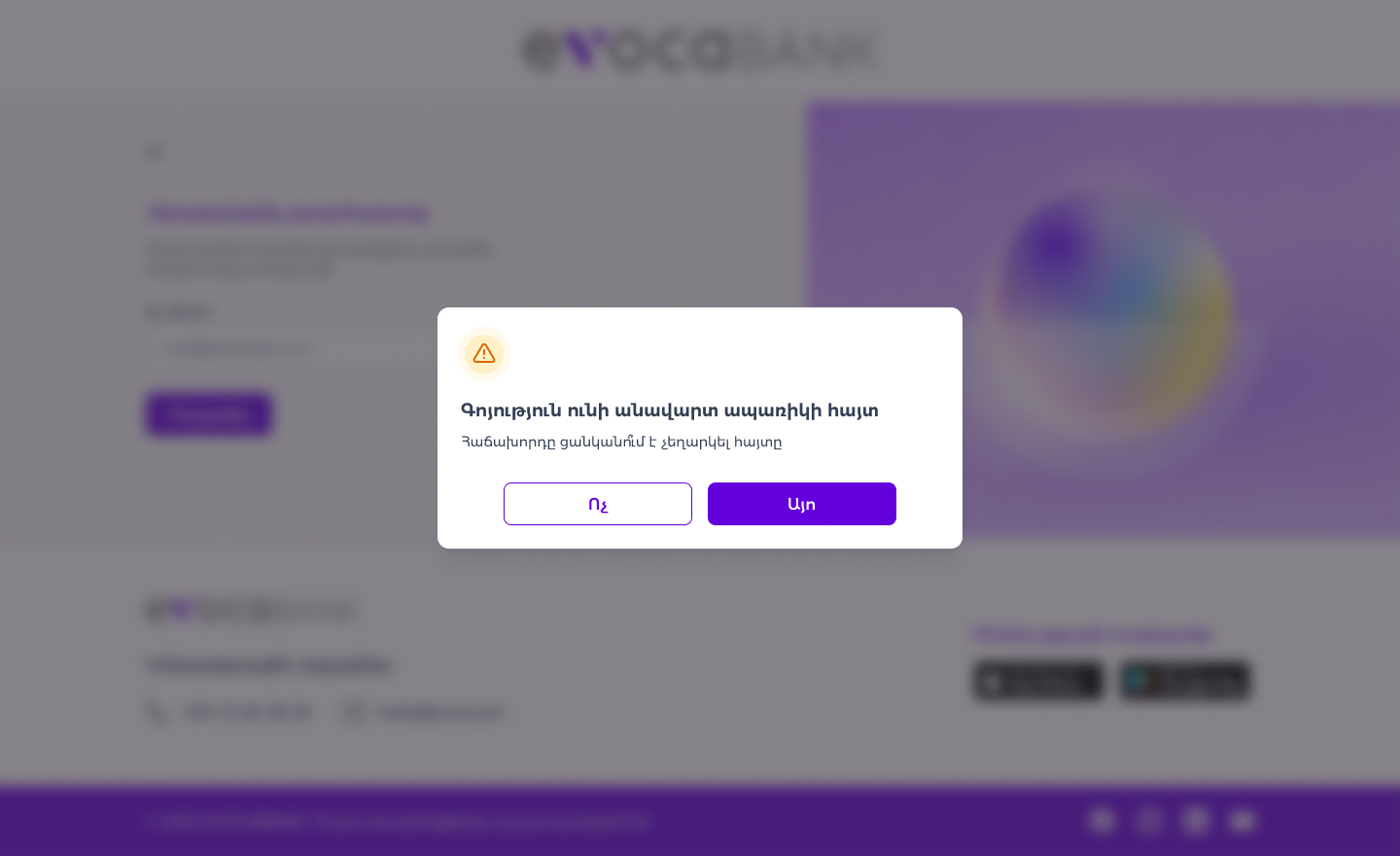
An unfinished application gets a question. If one already exists for the customer, a dialog asks whether to cancel it. It has a warning icon, a plain question, and two clear buttons, No and Yes. The page behind it is blurred so the decision has all the attention.
An empty list still makes sense. Before any search, the table shows its column headings with no rows, so users see what they'll get and where to start.
A small design system behind it.
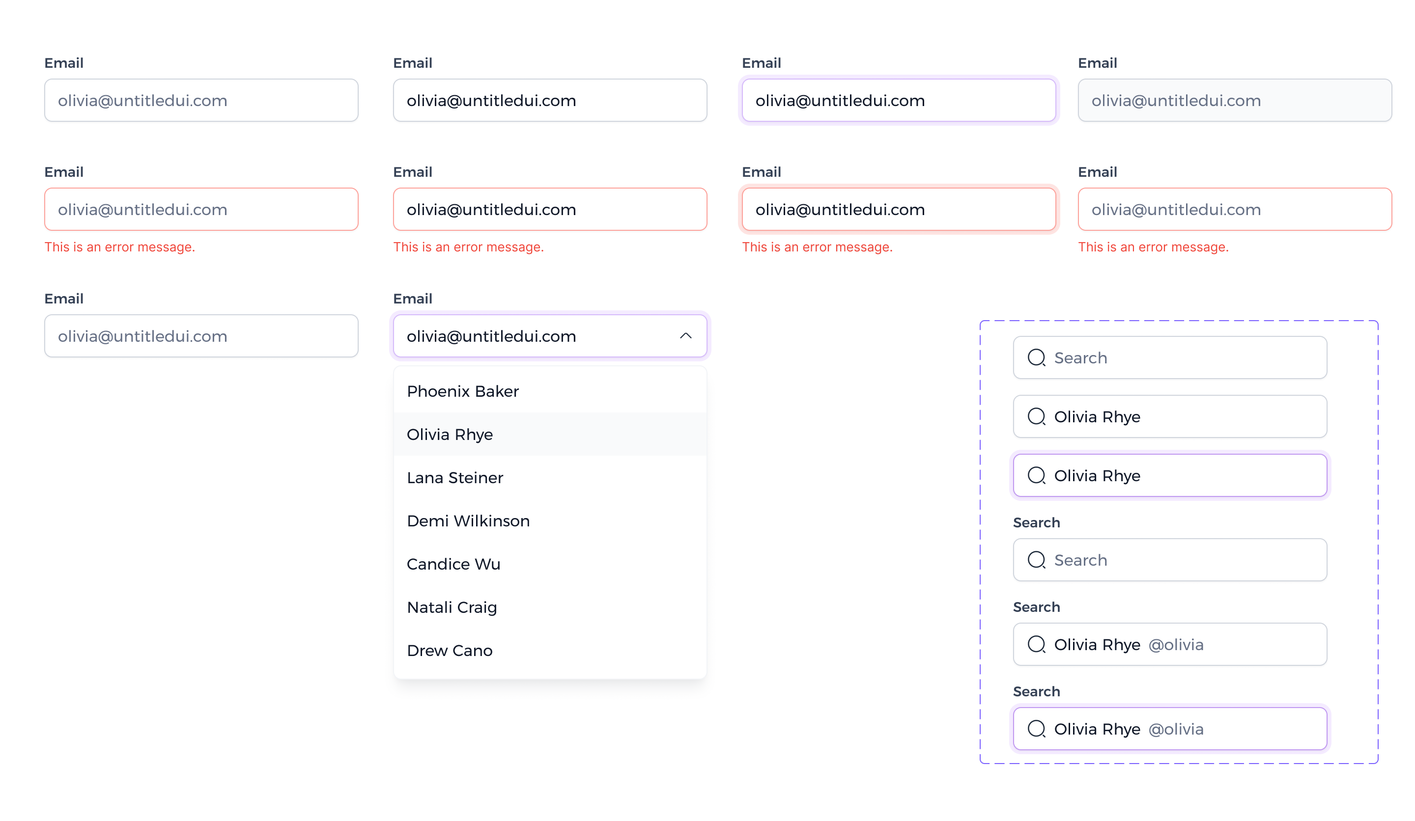
Inputs, in every state. Default, filled, focused, disabled and error, plus a dropdown and a search field. Focus gets a soft purple ring, and errors get a red border with a message underneath.
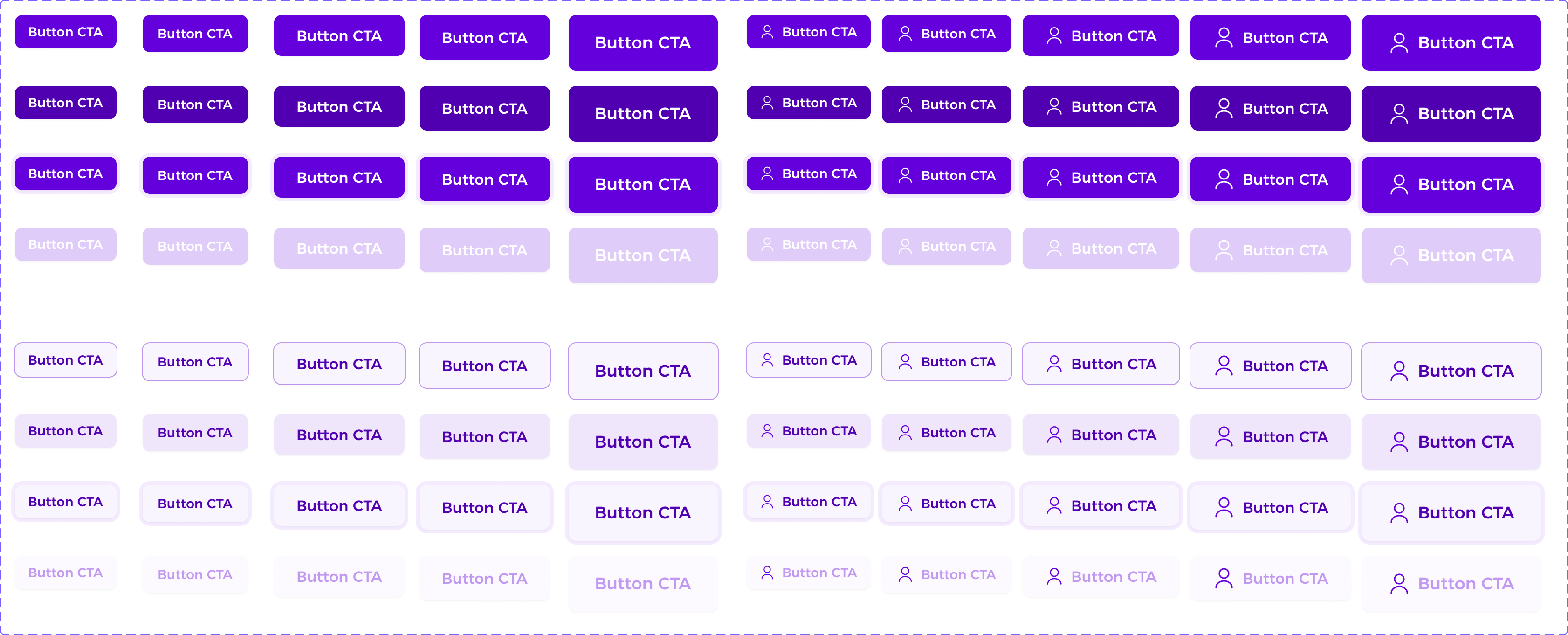
Buttons, in every size. Solid, outlined and tinted styles in five sizes, each with and without an icon, and each with default, pressed, focus and disabled states.
One accent. A single purple runs through the whole system, so new screens stay consistent without extra decisions.
How I'd validate it.
These are planned tests, not results. They show how the design would be checked with real users, and what would be measured.
Time on task
Measure how long staff take to submit one application, from sign-in to Send.
Error tracking
Log which fields cause the most mistakes, and fix the wording or the layout.
Status lookup test
Ask staff to find the status of a named application, and time it.
Staff interviews
Ask what they do after an application is sent, and what is missing.