How I framed the project at the start: the goal, the people it serves, and the limits to design within.
Working assumptions, based on the product's purpose and its screens.
← All work
Evoca mobile banking app
A mobile banking app where the balance, the everyday actions and every other service each have a clear place.
- Client
- Evoca
- Platform
- Mobile app
- Scope
- Home, services, transfers, accounts, history, contacts
A banking app is opened many times a day for small jobs: check the balance, send some money, find an old payment. So the first screen answers the common question fast, and everything else is easy to find without being in the way.
The brief.
Goal
Make everyday banking on a phone fast: see the balance, send money, find past operations and get help.
Users
Bank customers who open the app several times a day for small jobs.
Constraints
Many services to organize. Money and privacy matter. Small screens leave little room.
Who it's for.
Two proto-personas show the kinds of people the design is built for: what they want, what gets in their way, and what they need from the product.
Proto-personas come from assumptions about the audience, not from interviews. They are meant to be checked with real users.Nare, 26
Designer- Goal
- Check her balance and pay friends using a phone number.
- Frustration
- Too many steps to repeat the same transfer.
- Needs
- Quick actions, templates and transfers by phone number.
Hayk, 48
Shop owner- Goal
- Exchange currency, pay utilities and pay a loan.
- Frustration
- Finding the right service in a long list.
- Needs
- Grouped services, search and a clear history.
Follow the journey.
The journey follows one person from start to finish. For each stage it notes what they do, what they might be thinking, and how the design answers it.
Open and check
DoesOpens the app and looks at the balance.
ThinksHow much do I have, privately?
Design responseThe balance first, with an eye icon to hide it.
Choose an action
DoesTaps a quick action or opens Services.
ThinksWhere is the thing I need?
Design responseFour quick actions, and Services grouped and searchable.
Fill a form
DoesEnters the receiver, the sum and the details.
ThinksCan this be faster next time?
Design responsePrefilled details, the balance in the field and a save-template switch.
Confirm
DoesTaps Transfer.
ThinksIs this ready to send?
Design responseOne full-width Transfer button at the bottom of the sheet.
Review
DoesOpens History or Accounts.
ThinksDid it work, and what is its status?
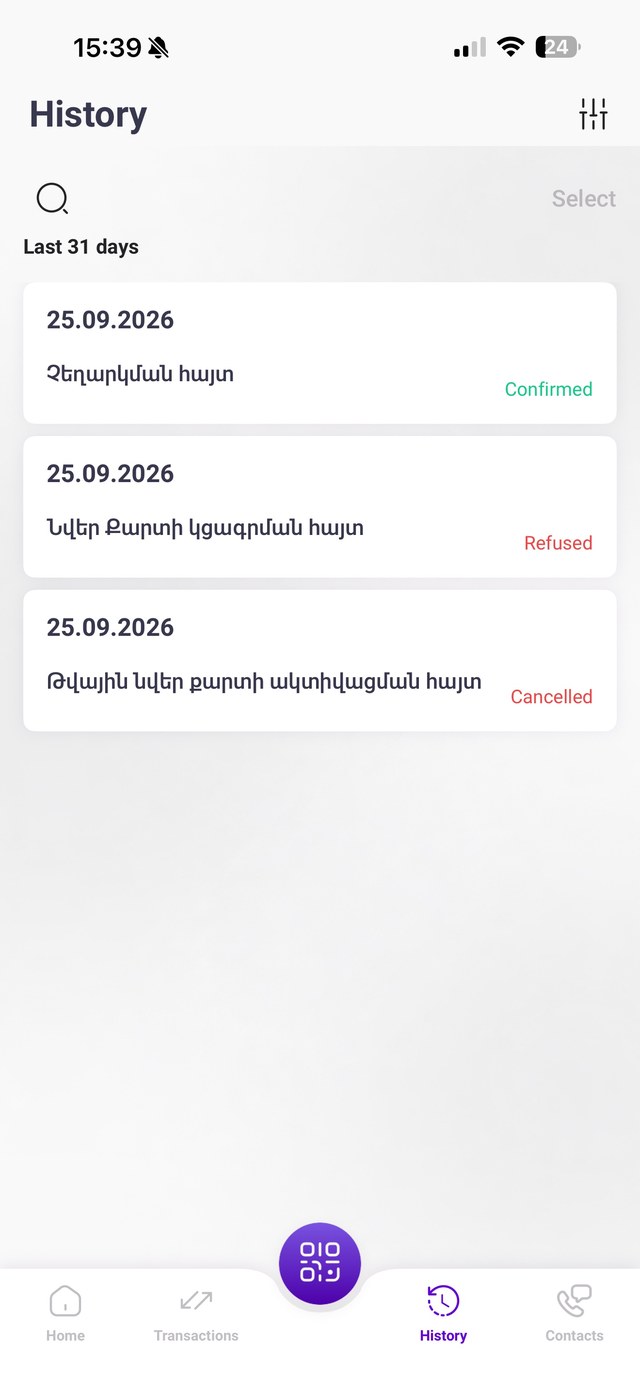
Design responseHistory cards with colored statuses, and an account transactions list.
Map the structure.
The structure shows how the screens are grouped, so every function has one clear home and related things sit together.
Mobile app
Bottom bar
- Home
- Transactions (Services)
- QR button
- History
- Contacts
Home
- Balance and currency
- Quick actions
- Banners
- Cards, Accounts, Deposits, Loans
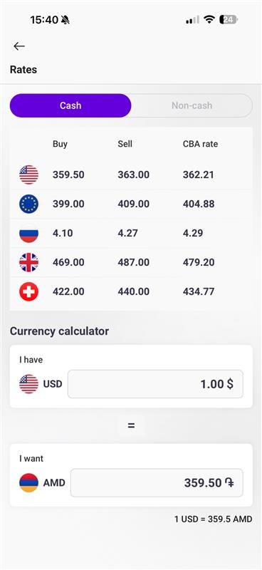
- Rates and Crypto
Services
- Templates
- Group payment
- Transfers: nine types
- Transfer via phone number
- Insurance, Budget, Utilities
Accounts
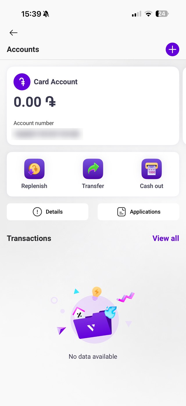
- Card account
- Replenish, Transfer, Cash out
- Details and Applications
- Transactions
Contacts
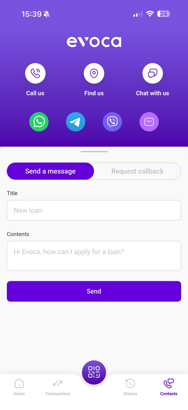
- Call us, Find us, Chat with us
- Messengers
- Send a message or request a callback
The flow and the principles.
The path through the product
- 1Open the app
- 2Check the balance
- 3Pick a quick action or open Services
- 4Fill in a short form
- 5Send the transfer
- 6Find it later in History
Principles behind the decisions
Privacy and control
The balance can be hidden with an eye icon, and the amounts stay blurred until the person chooses to show them.
Recognition over recall
Every service has an icon and a label, and the same icons appear on Home, Services and Accounts.
Progressive disclosure
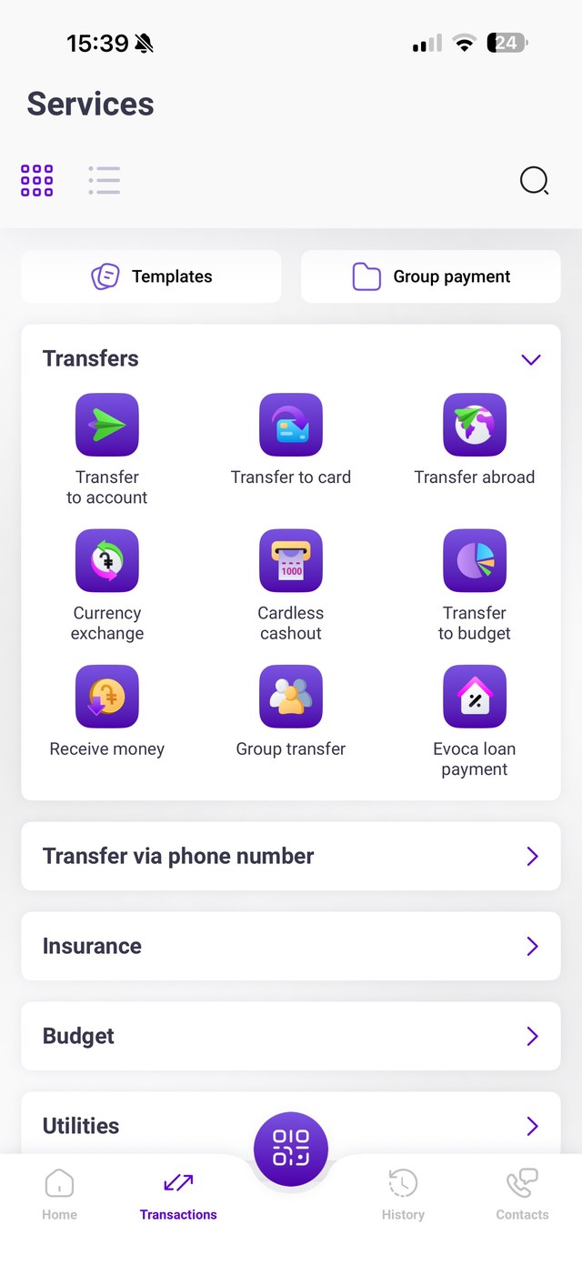
Home shows four quick actions. Everything else lives in Services, where the Transfers group can be collapsed.
Sensible defaults
Payment details are prefilled, the balance and commission are on the form, and one switch saves a template for repeat transfers.
From problems to answers.
Each assumed problem has a specific answer in the design. The screens that follow show them in detail.
Problem: Too many services to find one quicklyGrouped services, a collapsible Transfers group and a search icon.
Problem: Repeating the same transferTemplates and saved receivers, with prefilled details.
Problem: Privacy on a shared screenThe balance can be hidden with one tap.
A home for the everyday, a list for the rest.
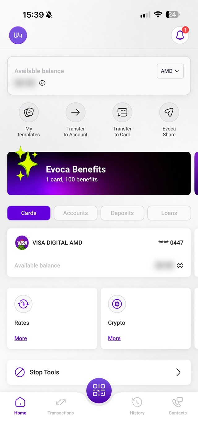
The balance leads. The available balance sits at the top with a currency switch and an eye icon to hide the amount. Four quick actions follow: My templates, Transfer to Account, Transfer to Card and Evoca Share.
Switch what you're looking at. Cards, Accounts, Deposits and Loans are four tabs on the same screen, so the list below changes without leaving Home. A promo banner and shortcuts for Rates and Crypto sit underneath.
Services for everything else. The Services screen groups all the actions as icon tiles, with nine transfer types in one collapsible group. Templates and Group payment sit at the top, and a search icon and a grid or list switch help people who know what they want.
A bottom bar that stays put. Home, Transactions, History and Contacts are always one tap away, with a round QR button in the center.
Transfers in one short form.
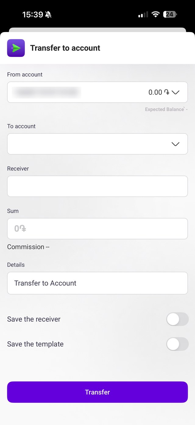
A sheet that rises from the bottom. Each transfer opens as a sheet with its own icon and title, so it's always clear which service you're in, and the Home screen stays right behind it.
Only what's needed. The form asks for the source account, the receiver, the sum and a short description. The account shows its balance right in the field, and the sum field shows the currency symbol before anything is typed.
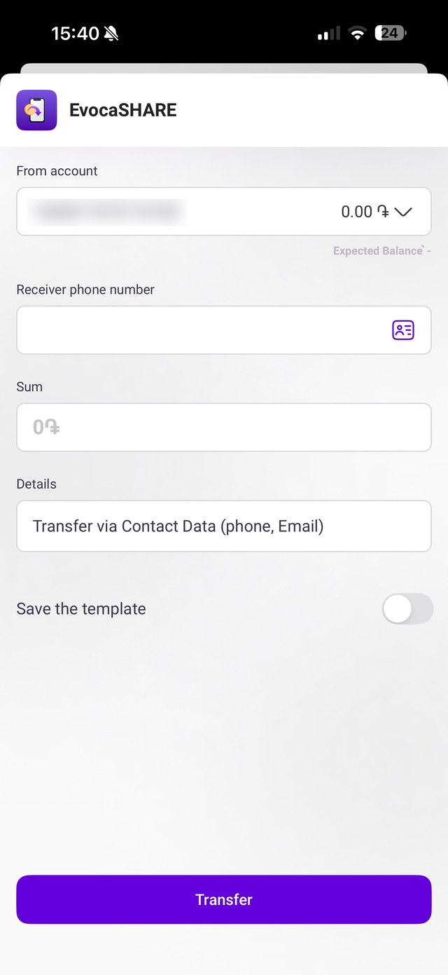
Fast for repeat use. The description is prefilled, and two switches, Save the receiver and Save the template, turn a one-off transfer into a shortcut. Evoca Share sends money using a phone number, with a contacts icon in the field.
One strong button. A single full-width Transfer button sits at the bottom of the sheet.
Accounts and money tools.
Actions next to the money. Each account is a card with its name, balance and number. Right under it, Replenish, Transfer and Cash out are large icon buttons, with Details and Applications as quieter options.
An empty state that helps. With no transactions yet, the screen shows a friendly illustration and the words "No data available", and a View all link stays in place for later.
Rates and a calculator together. A Cash and Non-cash switch sits above a table of Buy, Sell and central bank rates, with a flag for each currency. Below, a currency calculator turns "I have" into "I want" and states the rate in one line.
Find it later, ask for help.
History you can filter. Past requests are listed as simple cards with a date, a name and a colored status: green for Confirmed, red for Refused and Cancelled. A search icon and a filter icon sit at the top, and a label says the list covers the last 31 days.
Help is a tab, not a hunt. The Contacts screen gives three big options, Call us, Find us and Chat with us, plus the messengers people already use. Below them, a short form lets a person send a message or request a callback, with example text in the fields to show what to write.
How I'd validate it.
These are planned tests, not results. They show how the design would be checked with real users, and what would be measured.
Task test
Ask people to send money to a phone number, and time it.
Tree test
Ask where they would look for a given service in Services.
Usage tracking
Track how often templates and saved receivers are used.
Interviews
Ask whether people hide their balance, and when.